Surfaces: Focus – Profile: Emmanuelle Moureaux
For architect and artist Emmanuelle Moureaux, colour is life and emotion itself, and influences her approach to art and design.

Words By Kay Hill
THEY SAY that travel broadens the mind, but for Emmanuelle Moureaux, a trip to Tokyo as a student architect in her mid-20s was profoundly life-changing.
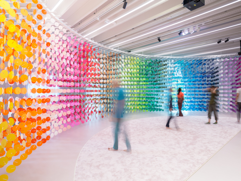
 In her Forest of Numbers installation, Emmanuelle Moureaux invites viewers to engage with numbers through colour.
‘When I saw the cityscape of Tokyo for the first time when I was student, it was as if I saw colours for the first time,’ she explains. ‘Thousands of colours seemed to be floating in the cityscape, as layers, as three-dimensional elements. It was so beautiful! I felt such a lot of emotions that in the first two hours I was in Tokyo, I decided to move there.’
Moureaux was a student at ENSAP School of Architecture in Bourdeaux when she made her eye-opening trip to Japan’s capital city – and while her instant decision to move to Japan may have seemed rash, she didn’t waver in her feelings that this was where she needed to be to fully develop her work. A year later, after completing her studies, she did exactly what she had promised, and moved to Tokyo to immerse herself in colour.
 Inspired by the bright and colourful Tokyo cityscape, Moureaux brings her Japanese experience to create her own ‘Shikiri’ concept of creating space with colours.
While Moureaux works as an architect, interior designer and product designer through the company emmanuelle moureaux architecture + design that she set up in 2003, it is her stunning series of 100 Colors art installations that have been making her a household name from Oslo to Osaka.
 Inspired by the bright and colourful Tokyo cityscape, Moureaux brings her Japanese experience to create her own ‘Shikiri’ concept of creating space with colours. Image Credit: Erwin Budding
100 Colors is the artistic outpouring of Moureaux’s overpowering experience of Japan colours. The very first one was created in 2013 in the Shinjuku Mitsui Building, one of Tokyo’s tallest corporate towers, as part of a council art festival. She filled the lobby of the building with hanging sails of 100 different shades of colour, and invited residents to come and find their favourite. It was an idea that grew wings, developing into an ongoing series that has graced buildings and exhibition halls around the world, including current projects in both The Netherlands and Japan and a permanent piece in Paris.
At the M. art museum in Almere, in the Netherlands, her latest creation, 100 Colors No.45: 8760 hours, allows visitors to experience the passage of time in unique and colourful ways until the end of February 2024. The installation, her first in The Netherlands, features 8,760 paper clocks in 100 colours, with each clock representing one hour. Together, all of the clocks depict the number of hours in a year.
 Inspired by the bright and colourful Tokyo cityscape, Moureaux brings her Japanese experience to create her own ‘Shikiri’ concept of creating space with colours.
Moureaux’s ongoing work with the 100 Colors series all has the same ambition – to help others to experience the joy of colour in the same way that she does. Each artwork offers the opportunity to take in the same 100 shades of colour in a single glance – something that seldom occurs in everyday life. ‘I chose the most beautiful (for me) 100 shades of colours to create my own personal colour palette,’ she explains. ‘The selection was totally intuitive and emotional, but the colours are inspired by those I see in the cityscape of Tokyo and the emotion I felt from seeing overflowing colours when I first visited the city in 1995.
‘I also want to give opportunities for people to see and feel colours with their senses, to become more conscious of the colours that exist around them. In 100 Colors, these shades are explored in various forms depending on the environment, to maximise their beauty. When that number of colours enter the body in a single glance, it triggers a physical response, and I want viewers to engage with that sensation.’
 Inspired by the bright and colourful Tokyo cityscape, Moureaux brings her Japanese experience to create her own ‘Shikiri’ concept of creating space with colours. Image Credit: Erwin Budding
The fact that her work has been highly prized around the world speaks of how this delight in colour transcends boundaries. It's a principle that Moureaux carries through from her art into her architecture, products and interiors. ‘Usually in architecture or interior design, colour is often considered as a minor element, a two-dimensional element, a finishing touch applied on surfaces and decided at the end of the design process,’ she says.
She has developed her own philosophy of using colour that she calls Shikiri, a word based on the Japanese words and script for ‘colour’ and ‘partition’, that underpins the way she works. ‘In traditional Japanese architecture, partitions such as sliding paper screens were used to divide spaces according to the function or the climate. These beautiful screens were disappearing from Japan, replaced by Western-style walls or doors [and so] I came up with my design concept of “Shikiri”, which means dividing or creating space with colour itself. I use colours as threedimensional elements, like layers, in order to create spaces, not as a finishing touch applied to surfaces.’
 Inspired by the bright and colourful Tokyo cityscape, Moureaux brings her Japanese experience to create her own ‘Shikiri’ concept of creating space with colours.
It’s a way of working that is constantly evolving as Moureaux’s understanding deepens, from the largely surface-based colours of her earliest art installations, to thinner lines of colour and then to more graphic pieces like Forest of Numbers (100 Colors No. 31) and Universe of Words (100 Colors No. 28). Her latest works delve even more into the philosophy of time and memory, including 100 Colors No. 47: Timeline, a permanent exhibition of a beam of colourful numbers symbolising the diversity of people and moments of life, on permanent display at Building Lumière in Paris, and 100 Colors No. 43: Memory, a work of 201,552 coloured numbers exhibited in Tokyo earlier this year.
New installations are already planned for the coming year, with no danger of the inspiration drying up. ‘100 Colors is an ongoing, never-ending project made for everyone,’ Moureaux says. ‘In their daily lives, people are usually not conscious about colour. I want people to breathe and immerse in 100 shades of colours, to see colours, touch colours and feel colours with all their senses. I want to add a touch of colour to the world.’