Coloured light – when to use it
It can enable a unique experience of a space, enhance identity, create character and even tell a story. Luciana Martinez, project designer at Speirs+Major, looks at four recent S+M schemes and analyses the specific role that coloured lighting played

From rich vivid greens to the lustre of gold, our eyes are constantly flooded with colour from both our natural and man-made surroundings. On a daily basis we are happily exposed to contrasting hues, complementary shades and subtle shifts in tone that influence how we see the world – all revealed by the light of our sun. We often revel in the coloured effects of natural light, whether it is the soft yellow light of dawn, the cool light of the midday sky or the rich saturated reds and oranges of a glorious sunset.

Coloured artificial light, however, does not share this same eminence. For many it is something that should be reserved for theatre and storytelling, for art installations and special events, and certainly not employed for the everyday. Coloured lighting schemes have come in for heavy criticism as the public struggles to relate to the message that the designers are trying to convey, while many poorly executed projects have tarnished the reputation of others by association.
Yet it is important that we remember that light and colour are inextricably linked. Light is a spectrum and the way we see colours, and indeed the way we experience a space, may be dramatically altered through our use of light and colour. When we speak of coloured lighting, most people immediately think of the rich saturated hues. In fact, these are only a small portion of the huge and wonderfully nuanced palette that modern artificial lighting technology has placed at our disposal. These days even ‘white light’ could be said to belong in the category of coloured light, when you consider the ever-increasing development of tones ranging from deep amber to cool blue-ish whites.

As lighting designers, we understand how materials can appear completely different under these different lighting conditions, and we use this knowledge to alter and enhance the perception of space and to visually communicate with people. We are able to create the impression that a space is larger or smaller, darker or brighter than it really is, not only by making the balance of light and darkness a critical element of the design, but also through colour. For example, washing a room in monochromatic light can render its detail obsolete, leaving a blank canvas while still providing sufficient illumination to navigate the space. In saturating a space with colour, the surfaces and materiality appear to blur into one, allowing for contrasting focal features to emerge.
On a larger scale, many monuments and infrastructure projects are increasingly being designed or retrofitted with colour-changing lighting. This approach offers cities the possibility to interact with the public. This may be achieved by changing colours and designs throughout the year to convey their solidarity with varying groups or nations on important dates, allowing static objects to be temporarily transformed into a living aspect of the urban landscape. Yet, when coloured light ventures outside and into our cityscape, we must give very careful consideration to how even one small highlight on a single element is tied to the wider image and experience of our cities after dark.

Despite a sometimes sullied reputation, coloured artificial light should really be viewed for what it is – an exciting and powerful tool for designers that can be very effective when used appropriately, regardless of sector.
It can enable a unique experience of a space, enhance identity, create character and even tell a story, with great theatrical flair, or a softer, more restrained effect.
The vital aspects lie in the choice of colour, the way it is applied, and an understanding of the effect of the colours we choose. Basic principles include using contrasting colours to create depth and highlight, or understanding how hues of colour can alter the appearance of materials and space. Beyond this, we also need to remember that colours have varying cultural significance around the globe which must be taken into account. Of course we need to be careful. Too much coloured light used in a blunt and ill considered manner can easily create a form of visual pollution after dark – both outside and within. As designers we must certainly always be able to answer the question ‘why colour?’ and ‘why now?’.
Halflife, Pedestrian Tunnel, King’s Cross, London
Allies + Morrison

In what would otherwise be another unremarkable pedestrian tunnel within London, this 90m-long curved tunnel was visualised as an illuminated graphic artwork. A lightwall runs its full length, activating the dramatic, triangular tunnel cladding and drawing pedestrians from the adjacent Tube tunnels. In 2015 a site-specific durational installation called HALFLIFE ran over three months, telling a story about the passing of time through the universal language of colour. Beginning at the outer edges of the colour wheel it took a slow journey to the rich saturated colours at its centre, immersing commuters in an experience that was never the same twice. Regulars would slowly watch the piece evolve every morning and evening, while one-off visitors would experience one or multiple sequences during their visit, marking a memory of the space in their mind.
Exmouth House, London
ORMS

The upgrading of an existing co-working space required an eye-catching entrance and an enhanced arrival experience to lead people through to the reception and communal atrium. The choice of saturated blue light acts as a bold contrast to the external sodium lighting and red brick facade, so that the entrance becomes a focal point along the street while also providing a backdrop to the red neon sign. Internally the saturated blue light creates a homogeneous surface that camouflages the exposed surfaces and its services, and allows the crisp white lighting to the atrium spaces, soffits and yellow reception area to become focal points.
Gasholders London, King’s Cross
Wilkinson Eyre Architects / Jonathan Tuckey

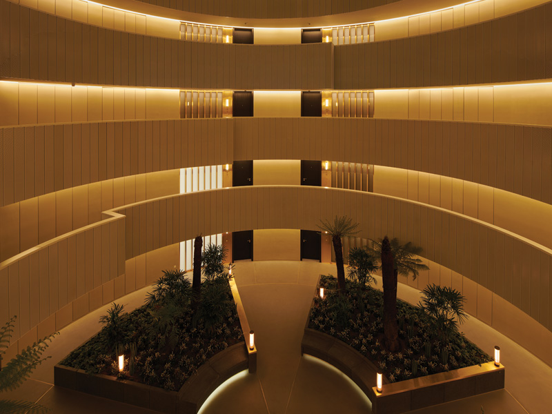
The dynamic white lighting in the recently completed Gasholders London is designed to enhance the experience of looking up and though the internal atria by supplementing and balancing the natural lighting conditions. Cooler white light during daylight hours transitions to a rich warm light in the evening. To punctuate the design, each apartment has a cylindrical entrance light in a deep warm amber tone, adding sparkle and a homely touch that is reminiscent of gaslight.
Macallan Distillery, Speyside, Scotland
Rogers Stirk Harbour + Partners

A newly designed distillery, visitor centre and exhibition experience in Speyside, Scotland, sees a unique combination of architecture, processing plant and lighting come together to speak of the history, the local landscape and the whisky-making process. Rich reds and deep blues were chosen to highlight the immense copper stills and water storage vessels to convey their respective temperatures but also help to visually break up the immense working industrial space. The intricate, undulating timber ceiling above is bathed in warm white light to enhance its richness while creating a perfect context for the dramatic saturated lighting of the equipment below. And while colour is used in various areas of the project to enhance the visitor experience, it is the selective use of colour at key moments that is the key to the success of the project.