Branding the right message?
We take a look at new and recent branding for some of the world’s modern and contemporary art museums, and how their branding gets the message across

Words by: Stephen Hitchins
So; I get an email from The Met. It indicates that I should ‘yield to the art now’. I click on the link, and hey presto, nothing there. They are very sorry but according to ‘Sincerely, Customer Support’ the page does not exist. Great! I try all the possible links on the page. Nothing. Customer Support regrets.

The Met’s new logo makes its public debut. It replaces the one based on a woodcut by one of Leonardo da Vinci’s contemporaries and in use since 1971. The Metropolitan Museum of Art / David H. Koch Plaza / © The Metropolitan Museum Of Art
There have been a number of things to regret lately. The Metropolitan Museum of Art has taken over Marcel Breuer’s 1966 Whitney Museum of American Art on Madison Avenue, and is embarking on a $600m new wing at its original Fifth Avenue home. It has chosen this as a suitably auspicious moment in its 146-year history to change its visual identity for the first time since 1971, an image based on a woodcut by a collaborator of Leonardo da Vinci’s, his maths teacher, one Luca Pacioli.
The M reflected the museum’s architectural plan, the geometry of Vitruvian Man, maybe even a diagrammatic representation of a Raphael: it was all there, historical reference, style, art and architecture, distinction. The new one reflects its need to identify various sites.
 Exhibition identity at The Met
 Exhibition identity at The Met
Real estate can drive identity in the art world. The previous symbol was adopted at the same time as practice Roche Dinkeloo’s comprehensive architectural plan for the development of the museum was accepted. Today, The Met as it is known has several branches across NYC: The Met Fifth Avenue, The Met Breuer, and The Met Cloisters, not forgetting The Met Online, all making a great deal out of that ‘The’ – with blood-red axe-blade serifs on the letter T. As dramatic as that may sound the overall effect is bland, one thing that The Met is certainly not.
 The Met Fifth Avenue opened the David H Koch Plaza in 2014. The Metropolitan Museum of Art / David H. Koch Plaza / © The Metropolitan Museum Of Art
In New York City, it’s confusing to say the least, and not that original either. Back in 2006 Paula Scher and Julia Hoffman of Pentagram had produced a new logo for the Metropolitan Opera that also emphasised the Met in its name. ‘See you at the Met?’ Which one?
 View of The Met Cloisters, part of The Met group of museums and sitting in four acres of land overlooking the Hudson. Image © The Metropolitan Museum of Art, New York
Tate has branches across the UK, all of which manage without that definite article, something dispensed with at the turn of the century at the behest of a design group. Both The Met and Tate’s identities were the work of the same firm, Wolff Olins: ‘We designed a range of logos that move in and out of focus, suggesting the dynamic nature of Tate – always changing, but always recognisable.’
As the Tate itself put it: ‘There are a number of variations of the Tate logo, or mark. They range from a standard logo to a blurred version, a faded version and a halftone version – dots rather than smooth fading. The marks have no fixed size or position and they are not connected with one particular Tate site. The Tate mark helps to build a brand that is fresh and fluid, but has some consistency – one Tate, with constantly changing expressions.’
 The Met Breuer building, formerly occupied by the Whitney and updated by Beyer Blinder Belle. The Met Breuer / Photography by Ed Lederman
While one may seek refuge in Oscar Wilde’s aphorism that ‘it is more difficult to talk about a thing than to do it’, it is not easy to avoid remembering that the same firm was also responsible for such embarrassments as graced the London Olympics and National Power. At which point, never forget William Blake’s remark that opposition is true friendship.
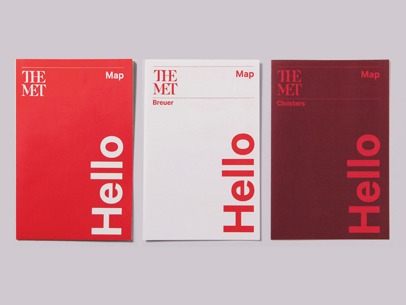
 The Met’s new logo by Wolff Olins, the practice also behind that for the London 2012 Olympics and National Power, spreads its wings over The Met publications
The new Met (museum) logotype is stacked, and squashed, enshrining its nickname in a new look. As critic Justin Davidson commented in New York magazine: ‘The whole ensemble looks like a red double-decker bus that has stopped short, shoving the passengers into each other’s backs. Worse, the entire top half of the new logo consists of the word the.’ It really is like something art college staff might well reject had it been submitted by a foundation course student trying hard to master a few rudimentary skills. Brands live and die in the minds of their customers. Judging by the comments that have appeared, this one was still born.
 The Met’s new logo by Wolff Olins, the practice also behind that for the London 2012 Olympics and National Power, spreads its wings over The Met publications
On first sight, it was enough to make me head to the Blue Bottle pop-up cafe on level five of The Met Breuer and demand a weapons-grade double macchiato from a tattooed barista, the one with an easy charm that must have taken years of hard work to burnish. When I asked her opinion of the identity there was nothing easy about her charm: it disappeared as she pulled a face and avoided the question.
Then I said something nice about the subtle architectural sprucing up of Marcel Breuer’s brutalist inverted ziggurat and the charm was switched back on. Perhaps most surprising was that The Met moved to the new identity without preparing the public that the face of a much-loved friend was about to change. Something The Met has acknowledged: ‘There may be some debate about the logo, because it involves change.’
 The Met’s new logo by Wolff Olins, the practice also behind that for the London 2012 Olympics and National Power, spreads its wings over The Met publications
Not everyone agrees. Design criticism is not a democracy. I approached my friend Michael Wolff, who left the business that still bears his name in 1983, what he thought about The Met and Tate. ‘I think it’s brave, as well as common sense, to use the names the public use, rather than full formal names, as the basis for a brand identity,’ he says. ‘Alan Fletcher did this brilliantly for the V&A with the iconic symbol he designed and which has now become commercially very valuable and a great classic symbol representing British culture around the world. Becoming a classic in this way takes time.
Wolff Olins inspired the Tate galleries to introduce new and iconic names that have quickly become popular: Tate, Tate Modern and Tate Britain, and given them an interesting, engaging and successful look. I think the similar approach it’s taken for “The Met”, makes sense. Why contradict a name that’s already been created by the public?’
 Branding for the Whitney is very sophisticated and reflects and suits its new location, says one commentator. The identity was created by Experimental Jetset. Street Pole Banner: Director of Graphic Design: Hilary Greenbaum; Designer: Hilary Greenbaum; Marketing Partner: Grey; Photograph by: Jens Mortensen
The Met has an annual operating budget of $300m, and annual visitor numbers around 6.3 million. Yet at the same time as The Met Breuer opened with a reported running cost of $17m a year, the new identity appeared at a cost of $3m. Retail revenues were said to have fallen by more than $3m last year, and The Met is planning job cuts – variously estimated at between dozens and hundreds.
Its ambitious plans may have been over ambitious. Its director and chief executive, the British art historian Thomas Campbell, has had to announce a two-year financial restructuring, including a slow down in construction of its new wing for modern and contemporary designed by David Chipperfield (‘It will be quiet for a while’ as once the schematic design is completed the project will go on hold). Inevitably, it has also invested heavily in digital. At The Met Online The Harvesters by Pieter Bruegel the Elder comes up in all its glory, and in such detail that even Tate’s Nick Serota had to admit that he found details he had never seen before.
 Branding for the Whitney is very sophisticated and reflects and suits its new location, says one commentator. The identity was created by Experimental Jetset. Stationery: Director of Graphic Design: Hilary Greenbaum; Designers: Hilary Greenbaum, Keri Bronk; Photograph by: Jens Mortensen
If anyone knows about branding in the world of art it is Liz Thorp, who has been at Sotheby’s for more than 25 years and is now its creative director, Europe. Unprompted, she echoed some of my thoughts about student work. ‘I am really struggling with The Met. The red itself, I like. But I just can’t get over the very first reaction I had to the logo itself. It screams college project to me. I’ve read the museum’s statements as to why it thinks the merging of serif and sans serif works. But I have to disagree.
To me each individual letter – and there are only six – has lost its own identity and integrity. Forced uncomfortably to join together, they have become hard to decipher, and ambiguous. To me it appears as if it could have been one of the first sketches, when the typographer was playing around with the letterforms, but that it should either have been rejected or been developed further.
 Branding for the Whitney is very sophisticated and reflects and suits its new location, says one commentator. The identity was created by Experimental Jetset. Calendar and Guide: Director of Graphic Design: Hilary Greenbaum; Designer: Kees Bakker; Photograph by: Jens Mortensen
‘The idea isn’t terrible, and with a small amount of further refinement it could surely have been made to work? I expect that it will subtly evolve the logo to make it work better once it has lived with it across a range of collateral. Rather than friendly – The Met is here for everyone, to quote the museum statement – I find it awkward and immature.
‘One of the things some commentators have landed on is that the new logo doesn’t make reference to what The Met actually is. I’m not sure that is necessarily a problem. Had the logo been beautifully executed, it wouldn’t matter. Any organisation that handles such a wide range of art genres will benefit from a word mark/brand identity that can hold its own when applied consistently to a diverse suite of items.’
 Branding for the Whitney is very sophisticated and reflects and suits its new location, says one commentator. The identity was created by Experimental Jetset. Calendar and Guide: Director of Graphic Design: Hilary Greenbaum; Designer: Kees Bakker; Photograph by: Jens Mortensen
The Met Breuer is a super museum. The Whitney was always a joy to visit, but now the Whitney has moved to a new building and The Met has taken over its previous home, in its reincarnation the building has come alive. Remarkably, it is not a city-designated landmark, so could be torn down if institutional priorities shift. Practice Beyer Blinder Belle is responsible for The Met’s new overall masterplan together with the transformation of this 7,600 sq m upside-down concrete and granite Mayan sculpture of a building. It previously supervised reverent restorations of Grand Central Station and the Empire State Building and so was well up to the task.
 Branding for the Whitney is very sophisticated and reflects and suits its new location, says one commentator. The identity was created by Experimental Jetset. Assorted Invitations: Director of Graphic Design: Hilary Greenbaum; Designers: Hilary Greenbaum, Keri Bronk; Photograph by: Jens Mortensen
For the new Met Breuer, it has brought the building back to the original architect’s conception with a wealth of minor detailed work. It has cleaned up the old and reinvigorated distinctive features such as the gridded concrete ceiling, the trapezoidal windows, and bluestone floors, removed all later changes and additions, oiled the woodwork, polished the floors, upgraded the metal stair handrails, inserted LEDs into disc-shaped light fittings – all part of preserving the authentic patina of aging materials and helping visitors understand and appreciate the evolution of the place over time.
 With the largest column-free space in Manhattan, the Whitney used the space to show an exhibition of work by American artist Stuart Davis; In Full Swing, this summer. Installation View of Stuart Davis: In Full Swing / Photograph by: Ron Amstutz
Just 10 minutes’ walk from The Met, it is not immediately clear as to why the museum needed to enlarge its estate at all. The suggestion has been made that it would use the extra space to exhibit contemporary art without which, so the belief is, no museum worthy of its name can apparently survive. If it does indeed show modern and contemporary art through the lens of history then that will be worthwhile.
The strength of The Met’s encyclopedic collection was there at the opening show in The Met Breuer: a grand sweep of history that starts in 16th-century Venice and then roams from Titian to Twombly, Tintoretto to Turner, Rembrandt and Rubens to Rauschenberg. The curatorial catch was that all the works were unfinished.
 With the largest column-free space in Manhattan, the Whitney used the space to show an exhibition of work by American artist Stuart Davis; In Full Swing, this summer. Installation View of Stuart Davis: In Full Swing / Photograph by: Ron Amstutz
The jewels were of a Van Gogh Street in Auvers-sur-Oise unfinished at his death in 1890, and Jan van Eyck’s St Barbara from 1437 which, according to your point of view, is either the oldest unfinished panel in Dutch art or the earliest surviving finished drawing. Contextualising the contemporary in this way, The Met’s new annex can avoid the fear of many museums, missing out on the latest thing, and not just appear to be an annex to the real thing.
 Four large viewing terraces are linked by three external staircases at the Whitney. Photograph by: Ed Lederman
According to Gertrude Vanderbilt Whitney, art offered an escape from ‘the big stagnation of riches’ and from 1914 onwards amassed several hundred contemporary works by American artists. Ironically, in 1930 she offered her collection to The Met only for its then director Edward Robinson, a man unimpressed by modern art and disdaining of its American proponents, to tell Whitney’s emissary Juliana Force: ‘What will we do with them, dear lady? We have a cellar full of those things already.’
Force stormed out and Robinson never heard of the $5m on offer for a new wing to house them. Thus, The Met missed out on, among other things, the largest collection of Edward Hopper’s work, the country’s painter laureate, ‘America’s Picasso’. Idiosyncratic and uneven the overall collection may be, there is no design, little photography and film, its 19th-century pieces and folk art were sold off years ago; but it is different and it is fun.
 American art at the High Line: the new Whitney building overlooks the High Line. Photograph by: Ed Lederman
Long before there were art fairs to trap unwary money, from 1937 the Whitney set New York’s artistic agenda every year with a springtime round-up of new work. After 1973, they became biennials. Hit-or-miss but never-to-be-missed, the biennial shows were always provocative and managed to have a fluent and expansive edge. In those days, galleries clustered near the museums. Then they went to cheaper accommodation nearer the artists in SoHo, and subsequently Chelsea.
The Whitney’s arrival at the southern end of that district will only help build links to the art world’s commercial precinct. (As an aside, Liz Thorp also mentions the Whitney: ‘I still think it does its branding and identity in a very sophisticated way. Its new look and feel suits its new location.’)
 With branches across the UK, Tates have managed without a definite article, dispensed with at the turn of the century. The Tate logo, also the work of Wolff Olins in 2000, came as a range of treatments, with no fixed size or position, based around 3,000 dots. The branding has recently been reviewed and refreshed by North Design. Image: Wolff Olins
When the deal with The Met was done (it will last at least eight years) and having established a location, the trustees of the Whitney interviewed several potential architects for its own new building. They asked each of them to name their favourite museum.
They all said the Menil Collection in Houston. Its architect Renzo Piano got the job. And so it moved from the Upper East Side downtown to Gansevoort Street, an area of warehouses and lofts in the dilapidated Meatpacking District, and a $422m new building by the go-to museum-man Piano.
 With branches across the UK, Tates have managed without a definite article, dispensed with at the turn of the century. The Tate logo, also the work of Wolff Olins in 2000, came as a range of treatments, with no fixed size or position, based around 3,000 dots. The branding has recently been reviewed and refreshed by North Design. Image: Wolff Olins
Sandwiched between the Hudson and the High Line it includes the largest column-free exhibition space in the city and doubles its exhibition space. The euphoria that greeted the new Whitney’s opening last year with Michelle Obama in attendance had New Yorkers walking on air – not surprising when you consider just how unusual it is for an organisation to emerge not only larger but also significantly better after the process of moving into a new home.
 With branches across the UK, Tates have managed without a definite article, dispensed with at the turn of the century. The Tate logo, also the work of Wolff Olins in 2000, came as a range of treatments, with no fixed size or position, based around 3,000 dots. The branding has recently been reviewed and refreshed by North Design. Image: Wolff Olins
There is frequently so much disappointment surrounding new museums and galleries – a list that could start with the debatable success of MoMA’s two enlargements, the vexed Guggenheim expansion, extending through the contentious additions to the Morgan Library & Museum that are a disappointment to many but that I like, and beyond.
 To coincide with the opening of the new building for Tate Modern this summer, the Tate’s logo was redesigned by North Design, refining and refreshing the Wolff Olins’ dot pattern concept and reducing it to 340 dots. Image: North
The new Whitney building can appear something of a monumental mishmash of confusion as well, an aggregation of architectural forms and materials. But it is comfortable, the art looks good there and when you need to rest there are terraces with leather sofas, a fine light and an airy restaurant called Untitled on the ground floor showing Robert Indiana’s The Electric Eat on the side wall to the kitchen, a good cafe on the eighth floor, great views across the river and Greenwich Village, and a three-level external staircase that draws visitors inside and out, meaning there are no dead-end galleries, something that has been sparred over by commentators (‘a fire escape on steroids’).
 To coincide with the opening of the new building for Tate Modern this summer, the Tate’s logo was redesigned by North Design, refining and refreshing the Wolff Olins’ dot pattern concept and reducing it to 340 dots. Image: North
On the eastern side, the building descends in tiers to its low-rise neighbours, and on the river frontage a truncated pyramid with protruding windows faces the world with confidence. The gallery floors are made of wood salvaged from defunct factory floors, galleries are lit by low-energy light fittings, a cogeneration plant in the basement produces heat and power using natural gas, the need for mechanical ventilation is minimised by regulating humidity, modulating airflow and drawing air in from outside whenever possible, condensation is reduced by the use of glass units with cavities filled with argon, and the glass is coated with a lining to filter out ultraviolet radiation. There are beehives on the green roof, and their honey is sold in the gift shop.
 To coincide with the opening of the new building for Tate Modern this summer, the Tate’s logo was redesigned by North Design, refining and refreshing the Wolff Olins’ dot pattern concept and reducing it to 340 dots. Image: North
This is full-throttle, unleaded Renzo. There is a sense of mission here that is yet to manifest itself at its old location, The Met’s latest annex. Graphics for the Whitney were designed by Amsterdam’s Experimental Jetset, and are everything The Met is not: fresh, different, memorable, and constantly developing and alive – the ultra-thin W flexing, contracting, and changing proportions endlessly in order to wrap itself around the museum’s ever-changing content. Perfect!
 To coincide with the opening of the new building for Tate Modern this summer, the Tate’s logo was redesigned by North Design, refining and refreshing the Wolff Olins’ dot pattern concept and reducing it to 340 dots. Image: North
Commenting on The Met, Hilary Greenbaum, director of graphic design at the Whitney says: ‘Designing an identity for an institution the size of The Met is a very tricky challenge, and one that takes a long time to even roll out… I don’t have much nostalgia for its old logo, and I think the new system will work well for it if given the proper care. Having been through a rebrand here at the Whitney, I know firsthand that it takes the support of the museum at large to make an identity system successful both for its launch and for its longevity.’
 To coincide with the opening of the new building for Tate Modern this summer, the Tate’s logo was redesigned by North Design, refining and refreshing the Wolff Olins’ dot pattern concept and reducing it to 340 dots. Image: North
The art world has become hyped across the media for high prices, social one-upping, and drop-in Z-list personalities, provided the art is the art of now. My barista at The Met Breuer had clearly taken a crash course in self-assertiveness for dealing with the toxic levels of ego so often to be seen in a gallery today. Add the concept of brand to that and you have an even more malignant mix in the eyes of those uninterested in art.
In this century, there has been fluctuating success for alter-globalisation and the associated anti-branding movement that believes branding only works on cattle. For those voices, the proliferation of brands over that time looks as though no one has been listening. The whole idea of brand is stronger and more embedded into our culture than ever before. While superficial imagery and the propaganda of branding is easy to criticise, the belief that branding really does drive business performance has been embraced by the art market and it was only a matter of time before major public galleries followed.
Architecture and interior design are all part of branding. Think of the Getty in Los Angeles, Berlin’s Neues Museum and Museumsinsel, the Museum of Islamic Art in Doha, Louvre-Lens, the Louvre itself, and Musée du quai Branly in Paris, the Museo del Prado, Rijksmuseum, the Guggenheims, the Acropolis Museum, Alexandria’s Bibliotheca – they have all used refurbishment, and rebuilding as part of their rebranding. At Munich’s Pinakotheken group of art museums identity has been a significant instrument in uniting separate buildings.
In redefining modern and contemporary art in terms of perception, popularity and price, Tate Modern set the pace. Despite its original, dubious, non-chronological rehang, it did create new relationships between artists and periods approaching the contemporary through the lens of the past and the past through the lens of the contemporary, something the new building does in spades by emphasising the global nature of art. At the same time it branded its environments.
Having extended the amount of space at their disposal, museums like The Met, Louvre, and National Gallery have all now broadened their offer and include the modern and contemporary. And as they have done that, so they have embraced the concept of branding to set a clear agenda in a unique voice to clarify their positioning with regard to the competition. The Met may have instituted what for some is a typographic car crash, but its ever-widening scope of endeavour coupled with ever-shrinking budgets, just like its competitors, now demands better branding. Others will certainly follow. Let’s hope the results are a better reflection on what they are meant to symbolise – like at the Whitney.