London Metropolitan University

Interiors that bring dilapidated educational buildings up to date and fit for purpose for savvy students in the 21st century has put the design team top of the class
Client: London Metropolitan University
Design: Cartwright Pickard Architects
Construction: Mace
Size: 7,500 sqm
Completion time: 18 months

When London Metropolitan University commissioned Cartwright Pickard Architects (CPA) to renovate and redesign four buildings, the brief asked for a design scheme that would stand the test of time.
The university hadn’t updated its buildings for almost 20 years, so naturally they were pretty dilapidated. But the designers were asked not to do anything too modish or that would look out of fashion in five or even 10 years. ‘We tried to future-proof it,’ says architect David Dickson. ‘We didn’t want to create such a bespoke environment that the university couldn’t adapt and use it in its own way.’
As with most public-sector projects, budget was a big factor in the design. ‘One of the points we made when we pitched for the project was that the existing buildings already had interest and elegance, so we didn’t need to waste money by covering everything up,’ says James Pickard, a founding partner of CPA.
‘We explained that you can save a lot of money by leaving the services in the ceiling exposed, and we showed images of schemes where this sort of industrial aesthetic has worked really well. If it’s done in the right way it can look really appealing, and it also saves the cost of a suspended ceiling.’
Perhaps the area that needed a refresh more than any other was the cafe/group-learning area in the university’s Moorgate building.
‘It was cold, dark and in such a depressing state,’ says Dickson. But the building’s Grade II listed status meant that the architects were limited in what they could do.
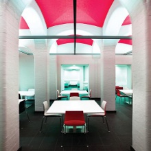
The basement space has corbelled arches and a vaulted ceiling, and the architects had hoped there would be some nice-looking brickwork under the room’s murky yellow paintwork.
‘Our initial idea was to strip it all back,’ says Dickson, ‘but when we did some tests we found that it was actually crude, dark engineering brick underneath.’ Plan B was to paint the walls white and the ceiling vaults red to define the room’s architecture.
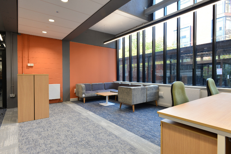
The university provided a list of approved furniture, so choice was limited, but CPA also created bespoke booths made of oak which it paired with Durat tables in the area.
The designers also pushed for all of the soft seating to come from Hitch Mylius. ‘We were quite keen to push for something that was of a good quality, something above what you’d expect,’ says Dickson.
Another part of the project, which is ongoing, involved transforming the ground floor of the university’s art school building in Whitechapel into more inviting space, including a new gallery, studios, cafe, gym and changing rooms.
‘The brief was to create a very visible public front to the building, a new exhibition space and a mixed-use breakout space that could also be used for enrolment,’ says Dickson. This involved making a new entrance, removing much of the existing cladding from the outside of the building and reglazing the front so that a newly created exhibition space faced the street.
Inside, the building relies on a simple palette of materials, with corrugated steel, exposed concrete soffit and concrete light shades creating a stripped-back, industrial aesthetic. New skylights were added, and soft seating by Hitch Mylius was chosen because it can be easily moved around and reconfigured.
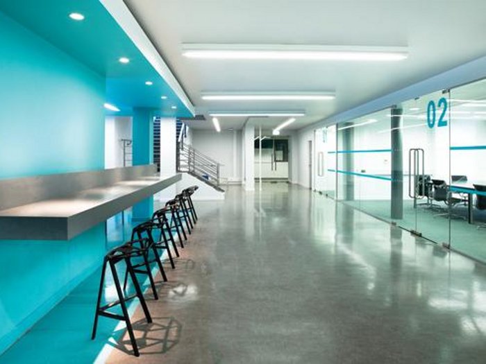
Dickson says that another part of the project, to renovate the university’s Tower Building in Holloway Road, involved a series of small but significant interventions. ‘It was a warren of different spaces,’ says Dickson, ‘and it could be very confusing’. The brief here was to refurbish classrooms and add informal areas that could be used socially as well as for work.
Some of these areas have soft seating by Hitch Mylius and others have bars made of Durat – both perfectly suit the way modern-day students work. ‘Students mostly use laptops these days, so they can work pretty much anywhere,’ says Dickson. ‘That means we don’t have to be so prescriptive in terms of how a space is used.’
This also enabled CPA to create work areas in corridors that would otherwise have been wasted space. ‘The university was very keen to use every space, so wherever there was a corridor, we placed sofas there so that students can sit down and work,’ says Dickson. ‘The university wanted to create an active learning environment, even in these transient spaces.’
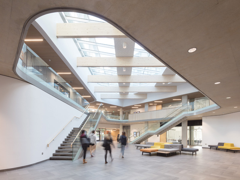
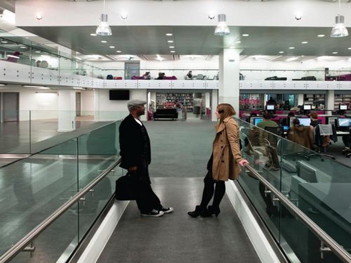
Perhaps the most radical changes have been in the university’s library, which occupies a converted factory building, also in Holloway Road. Dickson says this space was heavily used, but also run-down, claustrophobic and dark.
The first step was to demolish most of the existing walls, creating a large, open space. The designers then stripped everything back and added new services, including chilled beam and air-conditioning ducts.
‘The big challenge in the library area was how to integrate those services into what’s a very restrictive environment, because the building was not designed to be a library,’ says Dickson.
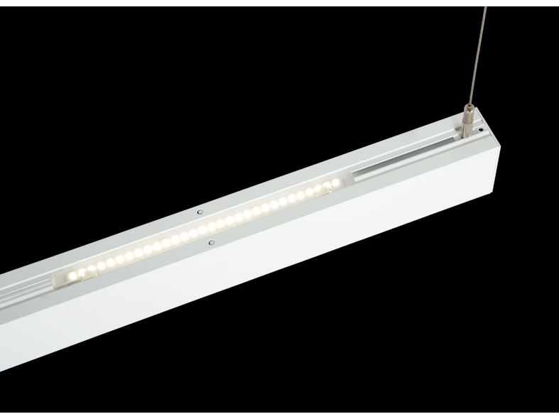
New windows on the ground floor allow in more natural daylight and pendant lights from Trilux help create a sense of intimacy within the double-height space.
The designers went for a simple palette of whites and greys in the library, set off with touches of fuchsia – a colour that was popular with the library staff.
CPA decided against exposing the ceiling works here, opting instead for a bespoke coffered ceiling tile made of perforated metal.
‘Although the library still has an industrial aesthetic, we didn’t want it to be dominated by the services,’ says Dickson.
Parts of the library now have the feel of a sophisticated office and, as Pickard says, you could be forgiven for thinking it was purpose-built. ‘It is an amazing space when you go in there now,’ he says. ‘It actually feels like a new building.’
‘There is a danger sometimes in assuming that students won’t want a serious environment,’ adds Dixon. ‘The scheme is still fun, but it’s also about giving the students an environment that feels a bit more sophisticated and serious.’
Main suppliers:
Furniture:
Lighting:
Benjamin Hubert at Decode London
Materials/bespoke furniture: