Dishoom, London’s West End
The iconic Irani cafe of Bombay has arrived in London, thanks to an inspired design and some help from the client’s relatives...
Client: Shamil Thakrar
Design: Afroditi Krassa LT
Size: 450 sq m
Completion Time: 2 years

‘Our approach was clear from the start: no stereotypes and no clichés’, says interior and product designer Afroditi Krassa of her scheme for Dishoom, a new ‘Bombay Cafe’ in London’s West End.
Dishoom’s enthusiastic and effusive proprietor, Shamil Thakrar, had seen Krassa’s work for the Itsu chain of sushi restaurants and admired her original interpretation of Japanese food culture. ‘We really liked her method of approaching things completely fresh – from the ground up,’ says Thakrar.
Curry houses have been a beloved part of British culture since the Seventies, but Thakrar was keen to represent the relationship between Britain and India in a way that felt more original – and that better suited the restaurant’s location.
‘There is a fantastic tradition in the UK of Indian restaurants which we respect and admire,’ says Thakrar. ‘But the relationship of Brits with curry houses is so enduring and familiar that it has probably bred some complacency. Dishoom was always about approaching the curry house from a very fresh perspective, communicating something different and interesting about India and its food.’
‘What we concluded is that we should keep the warmth and casualness of the traditional British curry house, but essentially ignore everything else,’ adds Krassa, ‘But I also wanted to avoid anything contemporary in a clinical, minimal sort of a way, or a post-modern ironic approach. We thought: “Let’s design something unexpected and fresh in a market that’s very congested”.’
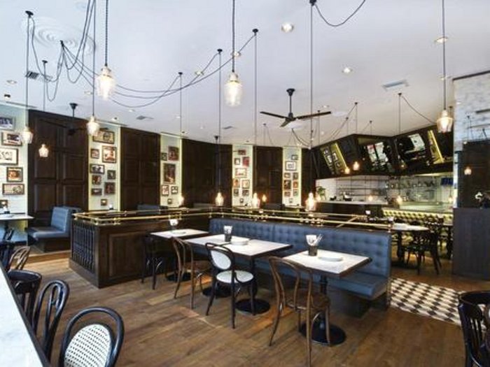
Several months of research and a few trips to Bombay later, the Dishoom identity was born. The interior scheme takes elements from traditional Irani cafes (all-day eating places set up by Iranian immigrants to India), street stalls and other informal eateries. Everything in the restaurant references the heyday of the Irani cafe, from the Thirties to the Sixties. Mismatched bistro chairs and ceiling fans were chosen, Krassa says, to ‘transport diners to a more exotic place and time’, and solid-oak panels, vintage mirrors and pendant lights hanging from a web of black cables say retro chic.
You may expect an Indian restaurant to be awash with bright, bold colours like red, green and orange, but Krassa says that this was ruled out early on. ‘At our first meeting I presented a list of no-go areas,’ she explains, ‘and as a result, a strict, monochromatic colour palette has been used throughout.’
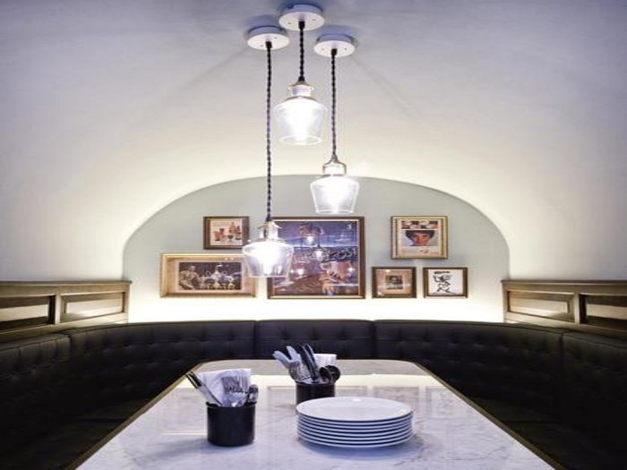
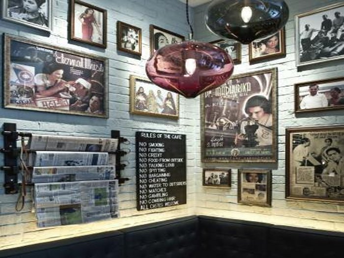
The shade of blue used on the walls is a close approximation of the colour most often used in the Irani cafes, booth seats have been upholstered in grey-blue leather, and the floor has a classic black-and-white check, but there’s plenty of colour in the retro Bombay portraiture and Sixties pop imagery, which adorns the walls. ‘We worked really hard on the artwork to get the look right,’ says Thakrar. Many of the portraits are of Thakrar’s own extended family.
It is details like this that elevate the scheme beyond that of a chain restaurant, and Thakrar’s singular vision combined with Krassa’s skill in interpreting it have seen Dishoom shortlisted in the category of best new design of Time Out magazine’s Eating & Drinking awards. ‘We are ecstatic, says Krassa. ‘For me, Dishoom is a prime example of how design can be an integral part of the operation rather than an add-on.’
‘We were exhaustively collaborative in our process, down to every last detail,’ adds Thakrar. ‘Not everyone will notice that the clock is an almost perfect replica of the clock in Bombay’s Victoria Terminus, or that the blue on the walls is the one you find in most of the Irani cafes, but details like this are worth the effort.’
Suppliers:
Lighting:
Oak panelling,oak flooring and custom tiling:
Bistro chairs: