Reworking the traditional terrace: Grosvenor Avenue by fourth_space
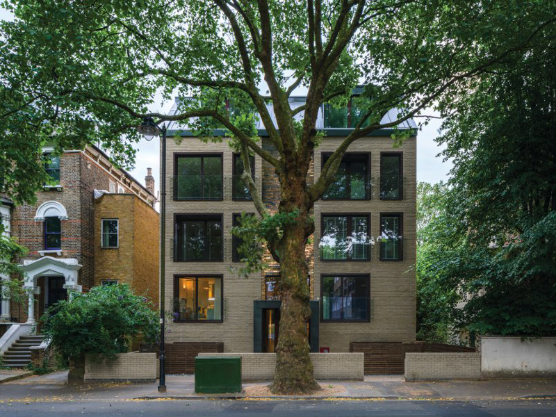
High-quality interior finishes, generous proportions and a living wall set this 10-apartment building in Islington above the run-of-the-mill speculative development, showing what a determined architect can do — even with a tough client and tight budget

Words by Veronica Simpson
You can’t always get what you want, as Mick Jagger so memorably whined in his Sixties heyday. But that doesn’t meant it isn’t worth trying. The spirit of this refrain (and response) underpins conversation with architect Steve Sinclair as he tours me around a recently completed residential project in Grosvenor Avenue, one of Islington’s more distinguished, leafy, Victorian-terraced streets.
The building was conceived as a thoughtful reworking of the European mid-century townhouse typology, translated to this 19th-century Islington setting, and it delivers on many fronts. It oozes far more solidity and spaciousness than the classic mid-century townhouse. And the scale and simplicity of its windows at the front allow ample light into each apartment, while their panes — as well as a central panel of glazed brick — reflect the tones and dappled light from this leafy avenue’s many mature trees back into the street. But Sinclair still winces as he describes the budget-slashing conclusion to this project, where the handsome grey brick they had picked out for the exterior — to match that of the mortar on the Victorian brickwork — was ditched and this much cheaper, poorer substitute (pale-yellow stock brick) selected instead.
 A three-storey living wall marks out the rear of the building. Image Credit: Gareth Gardner
When Sinclair and the two other directors in architecture firm fourth_space won the contract back in 2014 to design 10 apartments in a space then occupied by two substandard semi-detached post-war homes (classic London infill), their client — interestingly, a former architect — was sympathetic to their aims to do something substantially better than the usual ‘developer-lite’ treatment. As Williams has said: ‘The design sought to avoid the standard developer aesthetic of “lightweight” plasterboard partitions, chrome fittings and painted finishes.’
But these best intentions started unravelling as the scheme ended up spending three and a half years in planning. Sticking points included the architects’ insistence that the building’s storeys should be on a level with those of the Victorian houses on either side — starting with a sunken lower-ground floor. ‘We wanted to keep to the grid that runs along the street,’ says Sinclair. ‘Islington’s planners really weren’t happy. They wanted it all to be street-level access. But we managed to win that battle.’
 A central panel of glazed bricks on the facade complements and reflects the leafy character of the street. Image Credit: Gareth Gardner
Then a neighbour objected to the angle at which the back of the original scheme would project over his lower side windows. Eventually a compromise was reached: the left rear elevation is chamfered off at an angle, so the neighbour gets his daylight. And the tenants actually get a rather unique aspect to the left-hand flats’ exterior walls. During the delays, however, the developer got sidetracked — along with a big chunk of his financing — by a larger scheme; budgets were cut.
A struggle with the council over affordable units ensued (the council lost). Details and finishes suffered. Nevertheless, it went on site in early 2017 and completed summer 2018. And if the project hasn’t quite succeeded in meeting all the architects’ ambitions, it has delivered far more than most schemes of that scale and budget (£3m).
 A massive metal entrance portal features an overscaled wooden door. Image Credit: Gareth Gardner
A massive metal entrance portal with overscaled wooden door leads to a spacious, double-height lobby with shuttered concrete walls travelling the whole length of the stairwell. ‘We really didn’t want to do a poky-style developer entrance,’ says Sinclair. And they succeeded here. A smooth ‘concrete’ resin staircase leads down to the lower ground and up to the first, second and third floors, framed by a raw steel balustrade. Designer concrete light fittings (Tomado and Gant) add a further touch of class.
At this point, the building begins to feel rather Barbicanesque, and Sinclair reveals that their aspirations for the interior were indeed to evoke this Seventies icon by Chamberlin, Powell and Bon, or those of contemporaneous architects John Lautner and Denys Lasdun.
 A spacious, double-height lobby with shuttered concrete walls is a conscious break from standard 'poky' entrances. Image Credit: Gareth Gardner
There is a width and height, a generosity to the proportions of these flats and the care and craftsmanship over their finishes is reminiscent of the best of mid-century apartment housing (flats range from 70 to 80 sq m; all are two-bed). fourth_space wanted the interiors to be expressive of their concrete structure, softened with natural materials. Floors in living rooms and bedrooms are pale, solid oak parquet; there is bespoke Sapele timber joinery in the bedrooms; brushed brass fittings and fixtures in every bathroom and kitchen and on light switches and plugs. The kitchens were fitted by a local joiner, with counters made of pale marble. The en-suite bathroom off the master bedroom has herringbone, pale marble, floor tiles; though the smaller shower and floor space off the main corridor has been downgraded to simple stone tiles.
 Top-floor balconies at the rear, lined in dark composite decking, look out onto the tree canopy. Image Credit: Gareth Gardner
Balconies at front and rear are lined in dark composite decking. Those at the back on the top three floors are framed in foliage that spills down the rear of the building from the living wall, creating truly enticing nooks in which to drink coffee on a sun-drenched morning or watch the sunset at cocktail hour while relishing the luxurious amount of space at the rear. Overlooking the railway track of nearby Canonbury station, there isn’t another building for quite some distance. From front and rear, there is a lovely sense of being lifted up into the tree canopy.
The living wall is even more of a visual, sensory treat when seen from the shared garden — Sinclair calls it the ‘fuzzy monster’. I ask how complex a living wall is to install. ‘Not too complex,’ he replies. ‘We made the building watertight and structurally solid and installed a grid over it.’ The planting was discussed with a living wall specialist, and then they supplied and installed it. ‘It will need some regular trimming back,’ he says. And how hard was it to persuade the developer to add this pretty but purely decorative flourish? ‘He wasn’t too keen on it because it cost money, but his wife and kids loved it,’ says Sinclair. ‘We pushed it because we felt we are in the trees in the front and unusually for a London terrace you have all these mature trees at the back, so rather than have a cheap or cynical rear elevation, we would do something a little bit special — aspire to something a little bit better.’
 The concrete materiality is softened by the use of solid oak parquet floors in living rooms and bedrooms. Image Credit: Gareth Gardner
But perhaps because of this unique, luxurious detail, the sudden shift in tone closer to the ground is more shocking. The fencing and paving at the back are cheap and, frankly, nasty. Says Sinclair: ‘External works were done with no money at the end. They took the plans and changed every single detail and every bit of material.’
Despite all of this, looking at the project as a whole, Sinclair says: ‘We are really proud of this because we know the challenges that went with it.’ As well he should be.
This article was originally published in Blueprint issue 361. Buy the issue here, or subscribe to Blueprint