Lighting Focus: Unweaving the rainbow
Liz West employs an array of colours in her work, working intricately with light and the contrast between dull and dazzling visuals in order to bring material and space to life.

Words by Jill Entwistle
THE FOLLOWING pieces encapsulate three essential qualities of light: colour, dynamism and purity. Somehow at odds with each other, but often working together, and all elemental facets of illumination.
Artist Liz West is known for her use of vivid colours, saturating and transforming spaces with reflected, transmuted light rays and rainbows. Jason Bruges uses technology to create immersive, interactive artworks, increasingly inspired by nature and bringing it into urban spaces through biomimicry.
Both blur boundaries: between art and design, as well as art and technology. Both are concerned with bringing art to the everyday environment. Both seek to engage people and provoke response. Both appreciate the impact of light on mood and emotion, and the importance of light as a force for well-being.
Meanwhile, at the other end of the spectrum – or more accurately involving the whole spectrum – three recent lighting schemes explore the potential of white light to be equally evocative and powerful. Each fuses light and architecture, blurs the line between natural and artificial illumination, and makes art of simplicity.
OVER THE YEARS I have received feedback that my work offers a sanctuary or an experience of pure light and colour that is not commonly encountered on a daily basis. It is this purity of colour and light combined that I am most interested in, as our domestic and social environments are so full of visual noise from which we need a mental escape.
I often spend a lot of time in the space, almost like a mini artist-residency, to digest the impact of its scale, atmosphere and purpose. From this I either instinctively know what to make, or through intellectually interrogating the geographical and sociological history of the site, I make a piece of art that feels like it truly ‘belongs’ by tying together elements succinctly that have a human relationship to the space.

With flourescent coloured lights spraying against mirrored walls, Liz West’s work uses vivid colour palettes in order to create a sanctuary of light and luminosity. Spending extended amounts of time within the space or on-site, she is able to create works that have a solid sense of identity within their context. Installation: T8 fluorescent bulbs, cellulose gels, polycarbonate sleeves, mirror, wood, metal frame. Dimensions: 1000cm (L) x 500cm (W) x 240cm (H). Date: 2015. Image Credit: NATIONAL MEDIA MUSEUM
My creative practice defiantly demonstrates crossovers between art and design. That manifests both in the way I tend to make work especially for a particular project or space rather than creating without a site in mind, and in the way that I digest and follow briefs given by commissioners or clients.
I do, though, also have an ongoing experimental and research-based studio practice, where I develop my work through an interrogation of materials, drawing – making things that no one will ever see and where I sometimes fail.

When using coloured glass and transparent material, the movement of light and the changing of the seasons is an important aspect. Liz West’s awareness of this creates truly unique displays that change the viewer’s emotional perception of a space. Installation: Pigment-injected polyester. Dimensions: 700 linear metres. Date: 2021–22. Image Credit: CHARLES EMERSON
For me, the crossover exists more explicitly in the part of my practice that is commission-based rather than in the gallery works I produce. This is predominantly because these are the works where I am being asked to respond to a brief or site, specifically as a designer would. I aim to apply my artistic voice or ‘sonic-signature’ to every work I make (as any designer worth their salt does), no matter the origin of the project.

Liz West’s work melds a range of colours and hues with solid materials in order to bring light and brightness to a space. This creates a dazzling aesthetic and reflects her own views on the importance of light as a stimulant for well-being. Installation: T8 fluorescent bulbs, cellulose gels. Dimensions: variable, this image shows 10,000 sq ft. Date: 2015. Image Credit: STEPHEN ILES
This can sometimes be challenging in a commission-based scenario, as the clients often think that they know what they want until you perhaps surprise them with something unexpected and different. The ability to negotiate, and a belief in your concepts are key in both art and design territories.
So the starting point for every new piece of work is either a site visit if possible or an in-depth review of photos, videos or renders of the space (if I am not able to attend or travel, or if the site doesn’t physically exist yet). For a naturally-lit artwork, it is important for me to study the movement of sunlight throughout the day, seasons and year in order to foresee how the artwork proposed might change and affect the space.

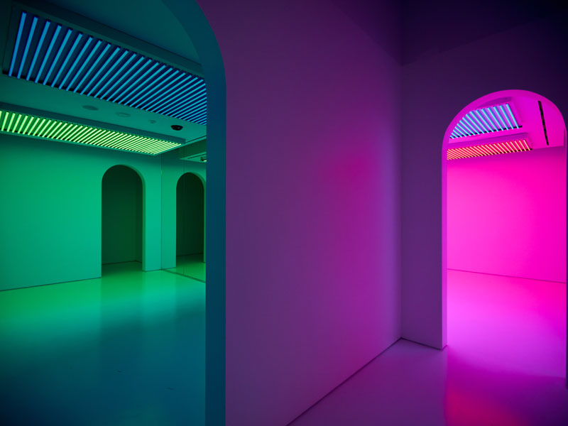
Some colours can clash and create a visual dissonance, but through using an innate instinct surrounding the properties of colours across the spectrum, Liz West achieves spectacles where a multitude of shades coalesce. Installation: Steel, polycarbonate, optically-clear vinyl. Dimensions: 600cm (L) x 400cm (H) x 350cm (W). Date: 2015. Image Credit: MDP PHOTOGRAPHY
Saturating a space with light and colour, illuminating and enveloping it, inevitability changes the viewer’s perception and emotional response to what they encounter, especially as the palette I choose is vibrant and therefore encourages positive associations with colour.
I have suffered from anxiety and also Seasonal Affective Disorder for as long as I am aware and therefore know the importance of creating work that promotes and helps one’s well-being. The world we live in is fast-paced and generally full of bad news, and so I believe it is crucial to put things into the world that are joyful and help people forget the clamour of their everyday lives, even if just for a second.

Dichroic materials produce a mesmerising effect in this work. Liz West’s striking use of vibrancy brightens the space that it is part of, allowing people to take joy from the location it is situated in. Installation: Polycarbonate, dichroic film, aluminium, stainless steel. Dimensions: 225cm (L) x 810cm (H) x 225cm (W). Date: 2019. Image Credit: ANDY STAGG
It is my artistic choice to use a strong, vibrant palette of colours because of my own personal preferences. It is a reflection of my personality and therefore, in essence, self-portraiture.
In the 15 years of research I have carried out into the science of light, colour theory and perception, I have found that both muted and strong colours have a positive impact on well-being. What is absolutely crucial is the way in which these colours are used and applied. Often I use muted tones to complement the richer hues, they help bring out the intensity of the more vibrant colours. I often use muted tones, such as greys and whites, for the colour of the structures or backdrops of my works. They allow the colours to sing and to be seen at the fore.
I am fascinated by, and passionate about, the relationships between colours. This forms the backbone of my practice. The exploration of colours, how they complement, mix and react to each other, forms many of the underlying concepts and aesthetics of my work. I spend a lot of time playing with colour swatches and finding out how colour translates in different surfaces and materials (reflective, transparent, flat and so on). From conversations with others, I have come to realise that I have an innate and instinctive relationship with colour that can’t be learnt or taught. It is this inherent connection with colour (and light) that my work is about – and which I aim to educate others about – through my immersive installation works.
It is true that certain colours work well together and others clash, but in some contexts a juxtaposition of colours is useful or visually stunning or powerful. I have found that people are generally scared of colour and don’t know how to use it properly, so when the proper and brave use of colours is encountered it surprises people, especially within the public realm, though it is more expected and accepted within a gallery context.
Interestingly, I am seeing the bold use of colour more and more with design projects. After the awfulness and human suffering created by the pandemic, there seems to be a leaning towards the use of vibrant colour in architecture and design to help bring joy and vibrancy to public spaces.
I hope to see this more. I think too often designers try to be artists and fulfil the part of the brief to have an artwork themselves. This tactic often fails as artists have a slightly different strategy and approach to spaces that cannot be replicated by a non-artist, most typically a conceptual agenda rather than just aesthetic.
I find that when designers and artists work together, this is where the magic happens. A project that brings together the skills and knowledge that derives from both creative specialisms is the most exciting and supportive to work on.
Liz West

Image Credit: CHARLES EMERSON
BORN in 1985, British artist Liz West graduated from Glasgow School of Art. Her wide-ranging works encompass site-specific installations, sculpture and wall-based artwork, ranging from the intimate to the monumental. Using a variety of materials and exploring the use of light, she blurs the boundaries between sculpture, architecture, design and painting to create works that are both playful and immersive.
Her vivid environments mix luminous colour and radiant light, and are created to provoke a heightened sensory awareness in the viewer. ‘I am interested in exploring how sensory phenomena can invoke psychological and physical responses that tap into our own deeply entrenched relationships to colour,’ she says. Her investigation into the relationship between colour and light is often realised through an engagement between materiality and a given site. ‘Our understanding of colour can only be realised through the presence of light.’
She has been commissioned worldwide by institutions and organisations including the Natural History Museum, National Trust, National Science and Media Museum, London Design Festival and Milan Design Week, and her work has been included in numerous exhibitions including UK Young Artists and Royal British Society of Sculptors in the UK, as well as internationally in Italy, Dubai, France, Germany, Spain, India and US.