Light + Tech
Jill Entwistle highlights the winners of this year’s FX Design Awards and looks ahead to the Surface Design Awards with some innovative lighting projects

BRIGHTEST AND BEST
Jill Entwistle looks at the winning lighting project and product in this year’s FX Awards, plus a shortlisted lighting scheme that was a strong contender

Rainlight Studio collaborated with Zumtobel to create Ambitus, winner of the lighting product category. Image Credit: RAINLIGHT
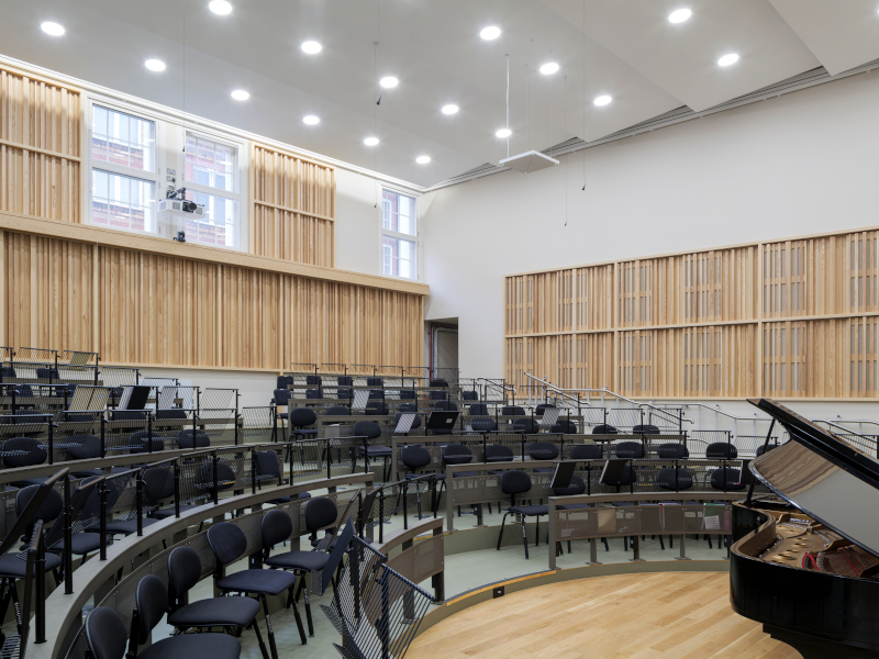
WINNER CATEGORY: LIGHTING DESIGN
XI’AN FANGSUO BOOKSTORE
By: GD Lighting Design
Reports of the death of the book are clearly greatly exaggerated, no more so than in China where bookshops seem to be springing up almost as quickly as property sales showrooms. Perhaps to counter the distractions of the digital, they are rather more than bookshops, often more like temples to literature. As culture has been widely used worldwide as an intrinsic part of regeneration, they are also a key part of urban renewal.
One of the latest is in Xi’an, once a stop on the Silk Road, and whose surrounding plains feature the archaeological remains of the famous Terracotta Army. It is also now home to the Xi’an Hi-tech Industries Development Zone, one of China’s earliest science parks, opened in 1991, and one of the six most successful urban zones in the country.
The 5,000m2, two-level flagship bookstore forms part of Xi’an’s fashionable landmark, Laochenggen G Park, a public cultural space described as ‘an innovative future city experiment’. The design of the bookshop encourages contemplation and, with its interlinked rooms, nooks and crannies, exploration. Interior elements referencing Japanese and Chinese palace architecture evoke the sense of a residence.

Image Credit: WANG TING
On the first floor, 10m-high bookshelves form a dramatic entrance. An open spiral staircase curves from the centre up to the second level, which doubles as a hotel lounge for the Grand Hyatt hotel on the upper floors. The stairway also wraps round an imposing 5m-high, circular book tower with an area of 176m2. Materials are primarily warm-toned wood and terrazzo flooring.
The lighting is judicious, underlining the warmth of the wood and integrated where possible to create a comfortable but functional glow from the shelves. Ceiling arches are gently uplit to avoid oppressiveness, with spotlights used regularly at their apex to provide downlight from a soaring height. Short linear fittings are mounted at a 45º angle on columns opposite the shelves on the second-floor walkways bordering the double-height space. These provide a visual rhythm as well as uplighting to the arches.
While fittings are generally discreetly located, they are also used to create a centrepiece installation, resembling fluttering sheets of paper, or pages of a book, suspended from the ceiling in the void above the stairwell.
Throughout the project, the question was whether to light or not to light, says GD Lighting Design. ‘For example, in the reading area for children, we needed to provide brighter and more uniform lighting, whereas the central book tower, which is itself luminous, doesn’t need additional lighting for the area around it.
‘The lighting design blends light into the architectural form, using shadow to outline the beauty of the architectural structure itself,’ continues GD. ‘The rhythm of change between light and shadow, the contrast between light and dark, creates a strong visual experience.’
Design: LSD Interior Design, Fangsuo
SHORTLISTED CATEGORY: LIGHTING DESIGN
SYMPHONY OF LIGHTS, PRIVATE RECEPTION HALL
By: Dumas Interior Design Group
Recycled polycarbonate pipes sound like an unpromising basis for a creative lighting installation, but in this instance their imaginative use as a facade scheme is stunning. Of different lengths and arrayed vertically, the white tubes are reminiscent of organ pipes. By day they form a pleasing graphic pattern, while at night, when they are lit internally, they animate the facade with a play of soft light and shadow.
‘On the outside, the irregular shape of the building body, coupled with an asymmetrical lamp tube design, creates a sense of harmony in accidents,’ says designer Yu-Lin Shin. ‘The whole exterior wall turns into a splash ink landscape painting.’

Image Credit: KUO-MIN LEE, JUN-JIE LIU
Cleverly the theme is reprised in the interior, where hanging vertical pipes, this time arranged symmetrically, form a chandelier. ‘The neatness of the arrangement is different from the exterior, but it creates a sense of geometry and minimalism,’ says Shin. ‘Several rows of vertical tubes are specially selected to incorporate lights to add playfulness to the overall pattern.’
The interior exploits natural light with expansive glazing, complemented by discreet indirect lighting throughout a wide range of spaces. ‘The overall lighting design is not deliberately highlighted, but because it is integrated into the space, it can be both functional and beautiful,’ says Shin. ‘It creates a soft light that is modern and minimalist, while creating visual interest.’

The exterior scheme is especially rooted in natural forces, explains Shin.
‘It’s like ocean waves, pushed back and forth, surging. Or looked at from another angle, like being in a dense bamboo forest, where the breeze is blowing and rustling. It gives viewers rich associations and adds interest and imagination to the design.’
WINNER CATEGORY: LIGHTING PRODUCT
AMBITUS
By: Rainlight Studio / Zumtobel
Also the winner of Best of the Best at the Red Dot Awards, Ambitus is one of those exemplary form-meets-function products. It marries technical precision and performance with minimal lines, producing a pleasing visual element in what can too often be a utilitarian field.
It also goes against the grain in being circular, and while not the first fitting to kick against the linear norm, it is unusual. In the highly regulated and demanding office environment, however, the shape is not just about aesthetics. Its circular form gives it a light distribution of almost 360º, which means greater efficiency and quality of light.

Image Credit: RAINLIGHT
‘For instance, a two-person office would normally require two linear lighting solutions but one ring luminaire is all it takes to ensure sufficiently high-quality light at the workstations,’ says Yorgo Lykouria, founder and creative director of Rainlight, who collaborated with Zumtobel over a ten-year period to produce the luminaire.

Image Credit: RAINLIGHT
‘It seemed to me a paradox to design a luminaire with straight lines when all natural sources of light such as the sun and moon are spherical,’ he continues. ‘Linear lighting systems often express disruption in a building that has complex geometry rather than order. Ambitus resolves this challenge because a circle is derived from a point; it can change direction and follows a modulated form without being oriented incorrectly.’

Image Credit: RAINLIGHT
The fitting features a computer-calculated, perforated pattern – ‘reminiscent of being beneath a starlit sky’. Its minimal lines are preserved by distinctive, thin suspension cables that also carry power and data. Controlled using programming systems or directly using a smartphone, the LED light engine offers tuneable white, direct and indirect lighting, providing cool white energising light or warm white calming light.
www.zumtobel.com | www.rainlightstudio.com
BENEATH THE SURFACE
With the return of the Surface Design Show and Awards in February, these products and projects explore the relationship between light and surface

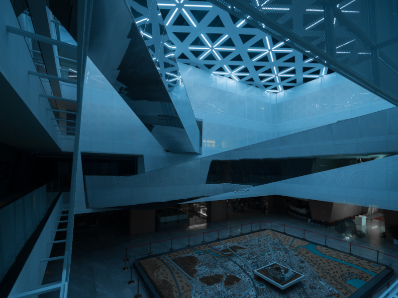
Shuifa Geographic Information Industrial Park Exhibition Centre, designed by AOE with lighting by Puri Lighting Design. Image Credit: WILLIAM YAO
SYNERGY IS not a word I warm to because of its associations with corporate whiff whaff but it does summarise very well the relationship of light to certain materials and their surface finishes. Marking the return of the Surface Design Show and Awards in February, the following products and projects demonstrate how to fully exploit the relationship of light with particular materials.
Reflective, transparent and translucent materials exhibit more obvious qualities in their relationship with lighting. But it is also a matter of how matt surfaces interact with light, the warming and texturing of a material or its use for more playful dappling and shadowing.
SHUIFA GEOGRAPHIC INFORMATION INDUSTRIAL PARK EXHIBITION CENTRE, JINAN, CHINA
LIGHTING DESIGN: PURI LIGHTING DESIGN
Beijing-based architect AOE wanted the new conference complex outside the city of Jinan in eastern China to resemble stylised rock formations. The four angular volumes lean towards and away from each other, creating canyon-like entrances.
By wrapping the outside of the building with perforated white steel, the architects have also affected the interaction with light from both interior and exterior viewpoints. An inner wall of glass is screened by the slanting walls of translucent mesh, allowing the structure to appear solid from a distance and lit with a soft diffuse light at night.

‘The interior of the building is obscured by the white perforated plating,’ says AOE. ‘As night falls, light shines through the perforated plates to make the whole building glow, like a piece of shiny marble standing in the wilderness.’
The outer skin also shades the glass from the sun to keep it cool, a more sustainable method of regulating the building’s temperature.

The density of the perforation is graduated, increasing as the floors rise to suit the functions of the rooms inside. Exhibition halls are located on the two lower floors, so the walls are more transparent, whereas the third and fourth storeys contain office space and have a denser mesh for privacy.
‘The gradual changes in the perforated plates allow the permeability of the building facade to gradually change from top to bottom, giving a sense of depth to the overall surface of the building,’ says AOE.
The ethereal effect of the facade after dark relies on a combination of exterior floodlighting and internal light transmission from the lower two floors. The exterior scheme is simple, with four 100W LED floodlights located at the four corners of the building, carefully concealed in sunken pits. The cooler 4,000K colour temperature complements the clean white facade. Puri Lighting Design explains: ‘Floodlighting gives an overall sense of the building, emphasising the block architectural style.’

The internal light transmission derives from the space between the perforated plates of the building layer and the main building, as well as the interior lighting. Linear uplights provide the illumination between the punch plate and the body of the building. As the perforated effect becomes more opaque rising up the building, the lit effect gradually reduces. This is compensated for by the floodlights, which retain the evenness of the illumination. The colour temperature for the third layer emanating from the building interior, the lantern glow, is a cosier 3,000K, a suggestion of warmth beneath the pure white light.
Achieving the right balance between the three layers of light was a major challenge, according to Puri. ‘It was not easy to deal with the degree of light transmission in the two layers in order for it to reflect the main body of the building. The desired effect is an even matching of the three light levels: floodlighting being the strongest, internal light transmission between the punch plate and the building the second, and indoor internal light transmission as the most implicit.’
The interior of the building is a continuation of the exterior, with the perforated plating element of the entrance area extending directly from outside to inside. The white metal mesh wraps the inner levels, with cut-out windows for visitors to look out over the lobby. A four-storey atrium sits at the centre of the exhibition centre, lit from above by a triangular skylight. Two mirrored stainless steel bridges crisscross the upper levels, their surfaces reflecting the white walls and the entire atrium volume. ‘The grey space formed between the glass curtain wall and the perforated plate enriches people’s spatial experience inside the building,’ says Puri.
The interior is an interplay between surface finishes ranging from high reflectivity or gentle sheen, through translucency to opacity, all reacting to light in individual ways. Further complex effects come from the use of dynamic coloured light.
AURORA BY ENZO BERTI
LIGHTING: KREOO
Glass and onyx, with their transparency and translucency, have a self-evident and natural affinity with light.

Magika
With the Aurora range, Venetian designer and architect Enzo Berti pushes the relationship further, playing with transparency and opacity, heaviness and lightness. Onyx – white, honey or grey – forms the basis of the collection, which includes floor and table lights in four combinations, with traditional hand-blown Murano glass used for the diffuser. A further refinement is the different finishes for the glass: transparent, smoky, and effects such as tiny air bubbles.

Miro-Meta
The three designs – Magika, Miro-Meta and Litia – all have an onyx base that houses the LED source, exploiting the colour and veining of the translucent marble beneath and softly diffused by the glass above.

Litia
‘We wanted to do something special with Aurora, working with two historical materials of the Veneto’s artisanal and artistic heritage,’ says Berti. ‘Each piece of this collection is unique: in the manual process of shaping the onyx, and in the process of mouth-blowing for the glass bubble diffuser.’
Litia and Magika both feature a diffuser like a soft bubble, slightly oval and with a circular hole on one side (Litia) or at the top (Magika). The onyx base of the Litia series resembles a polished pebble on which the diffuser appears to be balanced. The Magika support is taller and more like that of a conventional table lamp in shape. Miro and Meta reference traditional candle lanterns sitting on a squatter onyx base.
BIO4 WOOD-BURNING POWER PLANT, COPENHAGEN
LIGHTING DESIGN: SPEIRS MAJOR
BIO4 is a new wood-burning power plant and an important element in Copenhagen’s attempts to become the world’s first carbon-neutral capital by 2025. Just 2km from the city’s downtown area and diagonally behind the opera house, it is visible across the harbour when viewing the iconic Little Mermaid statue.

Image Credit: ALLAN TOFT
Designed by Gottlieb Paludan Architects, its 6m-thick, organic wooden cladding system references the forest as a source of renewable biofuel. By day, it softens the lines of the huge building, adding nuance and texture. After dark, the visual image is designed to be strong yet subtle. The carefully controlled projected warm white light gently reveals the depth and texture of the wood, while its dynamism signifies it as a source of power for the city.
Not only is it designed to be viewed from a distance, but also to be experienced immersively. A staircase leading to a viewing platform cuts through the main facade of the power plant. Ascending the stairs, the experience is one of moving through a luminous forest. During the day natural light creates a delicate shadow play through the trunks of the trees. As darkness falls, layers of projected light shift in speed, focus and intensity, casting patterns of light and shadow that never appear the same way twice. Sandwiched in the facade and immersed in dappled light, the sensation is designed to be like entering an alternate reality.
Unusually the technique used to produce the effect is relatively traditional.

Image Credit: KEITH BRADSHAW
‘It’s rare these days to see an animated facade that is not created by LED pixels, but part of the success of this project lies in our decision to use a contemporary LED source and digital control together with traditional theatrical projection techniques,’ says Speirs Major senior partner Keith Bradshaw. ‘We used filters, lenses and gobos and motorised animation disks, positioning, focusing and controlling the speed of the light in different ways to shape an organic feel, with no sharp edges. We worked through hundreds of tests and iterations to deliver this.’
A further complication was that they were dealing with a material that will change over time. ‘Getting the colour of the light right also required a great deal of effort,’ says Bradshaw. ‘We studied the effects of light on timber intensively, tuning the effect to bring out the warm tones, and taking into consideration the way the wood would silver with age.’
FINALISTS IN THE LIGHTING CATEGORIES OF THE SURFACE DESIGN AWARDS 2022

The Peacock Cellar in Shanghai, one of the finalists in the Light and Surface Interior category. Image Credit: DIRK WEIBLEN?????
Light and Surface Interior
The Peacock Cellar,Shanghai
ARCHITECT/DESIGNER: August Green
West Downs Campus, University of Winchester
LIGHTING DESIGN: Mike Grubb Studio
ARCHITECT/DESIGNER: Design Engine Architects
Concepts 99 University, New York
ARCHITECT/DESIGNER: Sid Lee Architecture
Shibori, Ahmedabad, India
ARCHITECT/DESIGNER: The Grid Architects
Rope – Terrace Cafe, Gandhinagar, India
ARCHITECT/DESIGNER: The Grid Architects
Light and Surface Exterior
Maggie’s Southampton
ARCHITECT/DESIGNER: AL_A
Wadham College, University of Oxford
ARCHITECT/DESIGNER: AL_A
Blue Steel, London
ARCHITECT/DESIGNER: MW Architects
Overcast House, London
ARCHITECT/DESIGNER: Office S&M
Sangini House, Gujerat, India
ARCHITECT/DESIGNER: Urbanscape Architects