Turning the floor into a canvas
In many commercial environments floors tend to be utilitarian and functional, but occasionally designers choose instead to use the space as a giant canvas. Kay Hill discovers projects where the floors get top billing

When it comes to flooring for offices, shops and public buildings, the first considerations are usually purely practical – how it will wear, what cleaning regime it will need and how much it will cost. After that, when aesthetics are brought into play, it is very often a question of choosing something as simple and unobtrusive as possible. In some cases, however, particularly within tech-based companies that want to appear youthful and radical, as well as in the hospitality industry desperate for differentiation from the competition, statement floors are becoming increasingly popular.
The Vinted 4th project by Lithuanian architecture collaborative YCL shows how dramatic use of colour helped to transform an old administration building in Vilnius into a creative working space for the world’s largest pre-loved fashion marketplace. ‘Our aim was to redesign the existing old plan into something that could represent the company at its best – young, interesting and open minded,’ says YCL architect Aidas Barzda. The 600 sq m office design boasts the usual markers of tech-company frivolity – hammocks slung across the windows, beanbags in the break-out areas and even a flight of steps going nowhere with cushions on them for creative thought. The old male and female toilet doors remain, but lead into a single communal washroom.
 BDP’s design for PWC’s new Manchester offices used hexagonal shapes as a reminder of the city’s bee symbol. Flooring: Shaw Contract Configure. Lights: Hex by Resident. Ceiling panels: SAS International. Image Credit: David Barbour
What really sets the scheme apart, however, is the luminous depth of colour on the floors, ranging from lemon yellow and lime green to deep purple, created using Upofloor’s Estrad sheet vinyl, along with carpet tiles from Modulyss. ‘Not to create a too colourful environment, we left the main working area bright and calm,’ says Barzda, ‘but the coloured areas in the plan allow for differences in taste of every person who works there. Vinted is a place where community and staff are connected by common ideas and a friendly work environment; the design means that everyone can find the right place for them, in one office.’
It’s an environment that should bring out the best in everyone. Béatrice Mange, creative and trends director at Tarkett, who has been studying the effects of colour on office workers (see side bar) notes: ‘Different spaces with different colour palettes can have a positive impact on productivity levels and help to maintain energy levels, enabling workers to keep focused, engaged and relaxed.
 YCL’s office scheme for Vinted in Lithuania’s capital Vilnius included a range of brightly coloured finishes to suit all tastes Flooring: Upofloor Estrad, Modulyss. Image Credit: Leonas Garbacauskas
By creating an office setting with a wide colour variety, workers can move around and find the right colour and space to reflect their physical or psychological state.’ The idea that a colourful environment can awaken creativity and improve concentration was at the heart of the flooring designs for Jasper Sanders + Partners New Bridewell student accommodation in Bristol. Jasper Sanders, the company’s design director, explains: ‘Student accommodation has become a competitive market as end users are now very discerning about the quality of environments they want to live in. Fresh Student Living, our client for this project, wanted us to create an inspiring and vibrant place, which would not only attract future tenants but also help them to connect easily with one another once they had moved in. When it comes to student accommodation, you can’t afford to be minimalistic; you need to create interiors that will excite and energise students.’
The architect designed a floor with flashes of bright colour on a background of anthracite grey, with vibrant yellows in study areas and more restful ocean blues in social spaces. ‘We set about creating a single destination for the communal areas,’ says Sanders. ‘The different activity areas were distinguished yet connected through the flooring design. We opted for Forbo’s Tessera Layout carpet tiles for this area, because the bright, contemporary colours and modular format meant that we could create a unique design, reflecting the long history of the University’s Department of Computer Science.’
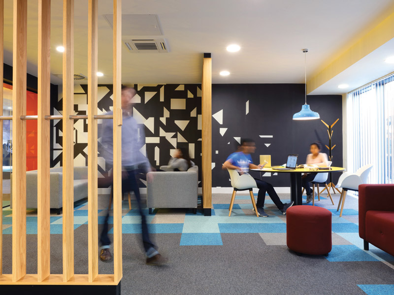
When interior design practice Officescape refurbished its Cambridge office, design director Linsey Hart wanted to create a low budget floor that was hardwearing and resistant to coffee spills, but also captured something of the company’s vibrancy. She used Txture carpet tiles from Modulyss as a base, adding vivid yellow Vision tiles, cut into triangles, to create futuristic, geometric patterns. ‘We had to meet the constraints of our budget, but wanted to incorporate a flooring feature that popped, so came up with this design as it allowed us to cut standard tiles on-site, without the need for a specialist service,” says Hart. In a similar vein, Form Design Consultants was tasked with creating a fun and contemporary interior scheme for Nucleus Financial’s new office space in Edinburgh, reflecting the company’s youthful identity and new hot-desking approach. Working with Tarkett, the team created a lively floor in bright orange and grey, the company colours.
 Wilson Associations asked Ulster Carpets to create bespoke Op Art carpets for the Sofitel Dubai Downtown. Flooring: Ulster Carpets. Image Credit: Momentary Awe Photography
Creating vibrancy was also the aim behind the colourful flooring that interdisciplinary practice BDP created for PwC. The professional services company had operated in Manchester for 80 years, but had just moved to three floors in the city’s tallest commercial tower, No1 Spinningfields. The new location was a chance to completely transform the company culture – out went private offices for partners, fixed desks and corporate blandness; in came sit-standing, hot-desking, collaborative benching and walls you can write on. The startling red hexagonal design of some of the flooring, from Shaw Contract’s Configure range, was a way of capturing the spirit of change, while also conveying a sense of place. Interior designer at BDP, Paul Stubbings, explains: ‘We used hexagon-shaped floor finishes, fittings and graphics corresponding to both the city’s bee symbol and the significant scientific discoveries made in Manchester. The space was designed to be a vibrant and creative collaborative working area and focal point.’
Another colourful floor scheme, this time at the Dutch Ministries of Social Affairs and Employment and Health, Welfare and Sport in the De Resident development in The Hague, was also rooted firmly in history, despite its contemporary look. The development’s main Castalia building was originally designed by Post-Modern architects Michael Graves and Sjoerd Soeters, with a window design echoing the form of Dutch canal houses, but the tiled floors were previously thought to have been inspired by Italian palazzi. However, when Arjen Aarnoudse, senior architect at HofmanDujardin, responsible for renovating the building, visited the Rijksmuseum, he was startled to see that the floor in a classic painting by Dutch artist De Hoog was almost identical to ones he had seen in Castalia. Spurred on by the find, after further research he discovered that Graves had also been influenced by Vermeer and Escher, and it inspired him to do something similar in his renovation.
 Officescape interior design company refurbished its own Cambridge office using bright yellow geometric accents for vibrancy. Flooring: Modulyss Txture
The result was a series of unique floor patterns throughout the offices, based on 30 different paintings from traditional and modern Dutch painters, including Mondriaan, Van Gogh and Rembrandt. Each of the selected paintings, themed on health and leisure or work according to which ministry they were going in to, were enlarged to the size of the floor, then translated into 50cmx50cm carpet tiles supplied by Desso, which had to create an additional 70 bespoke colours just for the project. ‘Whether you use flooring as an expressive element depends on the relation with the walls, ceilings, furniture, shapes and so on,’ says company partner Barbara Dujardin. ‘We like clarity in our design; if too many elements are visually expressive, the balance often does not feel right. In De Resident we used carpets as expressive elements – as the rest of the interior is more quiet, the floors can really stand out.’
Sometimes the use of colourful floors is simply playful, and a way to make a place memorable. With so many high quality modern hotels in Dubai, the stunning Op Artinspired bespoke Axminster carpets created by Ulster Carpets for a scheme by Wilson Associations, set the five star Sofitel Dubai Downtown apart from the competition.
Not all statement floors rely solely bold colours; some designers prefer patterning and shading to achieve the desired prominence. Celia Chu of Celia Chu & Associates in Taiwan used a mix of colours in a bold zigzag in carpet design for the Crowne Plaza Geneva, executed by Brintons.
‘The colourful carpet gives a modern, vivid and lively vibe to the space,’ she explains. Similarly, bright reds were balanced by more natural colours in a geometric leather floor design by Karin Verzariu of Key Interiors for a private client in London, inspired by the modern art of Sonia Delaunay. ‘The corridor was filled with art, black and white etchings and lithographs, and we felt that more colour would be a wonderful addition to this monochromatic scheme. The leather will age beautifully and gently; the natural pigments used will mellow slightly over time and be even more pleasing to the eye,’ she says. Zigzags come to prominence again in a project by Reis Design, using engineered wood products from Havwoods.
 Range colours of engineered oak wood herringbone flooring to create a masculine vibe for Cutter’s Yard barber and coffee shop. Flooring: Havwoods Italian Collection
The combination barber and coffee shop Cutter’s Yard in SE1 uses a herringbone arrangement of woods from the company’s Italian Collection to give a masculine, industrial feel, intended to convey the craftsmanship of the skilled barbers. It’s an interior that visitors won’t forget in a hurry, which is very much the intention of these statement floors. Jason Cherrington, director of Lapicida, which has just completed a unique floor made of differently coloured marble slabs for Porco Rosso in Harrogate, sums it up: ‘The brief was for a quirky, vintage look reminiscent of an old Venetian bar, and we created a highly decorative floor and bar plinth in a characterful mix of marble slabs. It is ever more important for independent businesses, especially bars and restaurants, to stand out from the crowd, and memorable interiors are very much part of the strategy.’

HofmanDujardin used Dutch paintings such as Akker Met Ploegende Boer by Van Gogh. Flooring: Havwoods Italian Collection. Image Credit: Havwoods Italian Collection
Using Colour
Béatrice Mange, creative and trends director at Tarkett, has been studying the psychology of colour and its ability to directly impact on emotions, behaviour and wellbeing in the workplace. She has divided colours into four distinct groups relating to the responses they create.
Fresh & Optimistic primarily consists of warm, mellow, bright and intensely optimistic yellow tones, as well as numerous shades of green. These generate invigorating feelings of revival, energy and joie de vivre. Health, stability, peace and tranquility are also important perceptions from this range of colours, and studies have shown that they have a positive influence on concentration.
 HofmanDujardin used Dutch paintings such as Akker Met Ploegende Boer by Van Gogh. Collection. Image Credit: Matthijs Van Roon
Warm & Inviting consists of orange tones and energising red hues to stimulate creativity. These colours create a feeling of strength, warmth and dynamism. Their psychological impact encourages self-assurance and self-confidence, reduces depression and melancholy and has a positive effect on passiveness and apathy.
Cool & Calming includes cool blue tones and bright purples, which lighten emotions and encourage the process of increasing awareness. This combination of colours is synonymous with tranquility, peace and freshness. They have a purifying, soothing effect that reduces blood pressure and develops confidence, while minimising stress and reducing anxiety and inhibitions. These refreshing and purifying colours open up the mind through their link with light and the openness of space and the sky, helping to create a peaceful atmosphere.
Basic & Natural is a palette of warm grey tones, cool beige shades and light brown hues, that minimizes stress and reduces anxiety. Linked closely with the earth and other natural materials, these shades creating a feeling of intimacy, peace and security, and scientific studies show that grey tints and shades linked to the earth reassure humans and make us feel protected.