Brief Encounters: Assemble design new permanent galleries for the Wellcome Collection
The Wellcome Collection’s latest permanent exhibition, Being Human, is not just visually stunning – it also takes a progressive approach to inclusivity

All images courtesy Wellcome Collection
Words by Veronica Simpson
There can be few better showcases for inclusivity than the Wellcome Collection’s new permanent gallery and exhibition, titled Being Human. Designed by Assemble, the aim of this exhibition in London is to showcase humanity as it is now, in all its complexity and diversity.
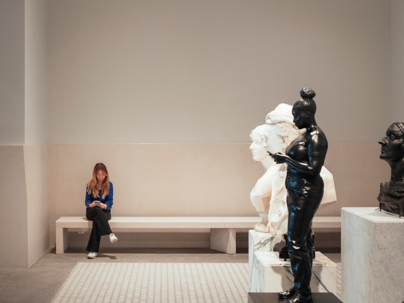
There are artworks liberally strewn throughout this handsome gallery, which had hosted the Medicine Now exhibition. That semi-cellular, red and white, ‘noughties’ scheme has been removed and, true to the Turner Prize-winning architects’ form, Assemble’s priority has been to expose the best aspects of the original architecture and then subtly enhance them. The room’s high windows have been reinstated, its walls tinted a rather Assemble-esque palette of inky indigo and pale verdigris that tone beautifully with the pale, oversized parquet flooring and the sculptural slabs of sanded and bleached plywood used for the display furniture. Assemble’s instincts were also strategic to the choreography of the contents, working with Wellcome Collection curator Clare Barlow, along with print and graphics studio Kellenberger-White, to ensure maximum impact and clarity.
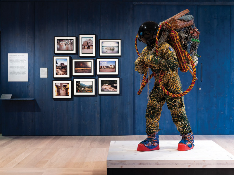
Exploring the main themes – genetics, minds and bodies, infection and environmental breakdown – what you notice first is the amazing array of artworks. While the Wellcome Collection has pioneered the use of interesting art within its scientific or philosophical explorations of the human condition, the factual exhibits typically far outweigh the creative. Here, the art and science dovetail seamlessly; in fact, it’s the artworks that carry the narratives. What strikes you next is how the various objects and artworks have been choreographed to make the space accessible to the widest array of visitors. For example, the low bench by the main AV screen, upholstered in an on-trend mustard fabric, is actually set to the left of the monitor, to leave the central position free for wheelchair users – who are often relegated to the back or side of a seating arrangement, straining to see the display over peoples’ heads.
The metal caption displays on each plinth are set at just the right height – 800mm – for wheelchair users, or children, while being not too far down for any able-bodied/sighted visitor to read. What’s more, where a caption relates to a particularly textured or sculptural artwork, a small tactile rendition of that work, alongside the braille caption, is featured.
 The room’s high windows have been reinstated and the walls tinted in indigo and verdigris
Professor Richard Sandell, of Leicester University’s Research Centre for Museums and Galleries, was at the opening of the exhibition and declared it sets a new benchmark for accessibility. He and his research team worked closely with the Wellcome curators from the outset, putting together a consulting group with a wide range of physical and sensory restrictions, in order to workshop all the elements. They were involved in the obvious practicalities, such as identifying the most readable fonts and the most legible captions (matt-black lettering) but also for larger design elements. For example, Assemble was asked to provide a slightly different timber on the floor than on the plinths and display structures to help those with visual impairments to distinguish where the furniture started or ended; in fact, Assemble went further, painting the solid timber plinth bases black. There were also strict requirements for lighting: either daylight or a soft, naturalistic ambient glow illuminates the room while the objects are bathed in a more diffuse focus lighting than the usual spotlights.
The Leicester focus group was also consulted on wording for these provocative and fascinating works, as well as the choice of artworks themselves. This helped the curatorial team navigate sensitivities around gender issues, as well as those of disease. As Sandell says: ‘We started by asking: what’s the story that’s going to be told? And if they are stories of physical and mental difference, how could we include and incorporate all that diversity and avoid people being represented as objects of curiosity? The priority was challenging the normative view of disability as something to fix.’ In this, Sandell’s team and the Wellcome’s curators have been particularly successful. For example, one particularly moving photograph shows US artist Kia LaBeija, posed in her red prom dress, having a blood sample taken in a clinic. LaBeija is a proud survivor of HIV, having been born with and subsequently lost her mother to the disease; she had been told she would never live to enjoy her prom. Equally poignant are Basse Stittgen’s Blood Objects: three small, black dishes, designed to be held in the palm of the hand, which are made entirely from plasticised HIV blood, donated by three volunteers, whose names and dates of birth are provided beside three audio handsets, which allow people to hear each of their stories.
From genetic engineering to gender fluidity, from global warming to prosthetic, aesthetic and technological body enhancement, it’s a rich and emotionally conflicting mixture to wrestle with. What the art – and that includes the artistry of its presentation – does is add integrity, charisma, intensity and fascination. It’s the humanity, rather than the science, that curator Barlow wanted the show to foreground. She concludes: ‘If I would like one final message to be taken away from this exhibition, it’s that we are all different, we are all valuable and we are all connected.'