The effect of colour in the built environment - the scientific evidence
So much waffle is written about how colour affects us. You hear how one hue can create a calming effect, while another will provoke passion, or the like, without a shred of evidence to back up the claims. Blueprint decided to get to the bottom of this and find out just how much measurable scientific proof there is of the effect of colour in the built environment. We teamed up with Milliken Carpets, which commissioned colour expert, Byron Mikellides, Emeritus Professor of the Place, Culture and Identity Research Group at Oxford Brookes University, to tells us what empirical knowledge exists on this subject

Words - Byron Mikellides
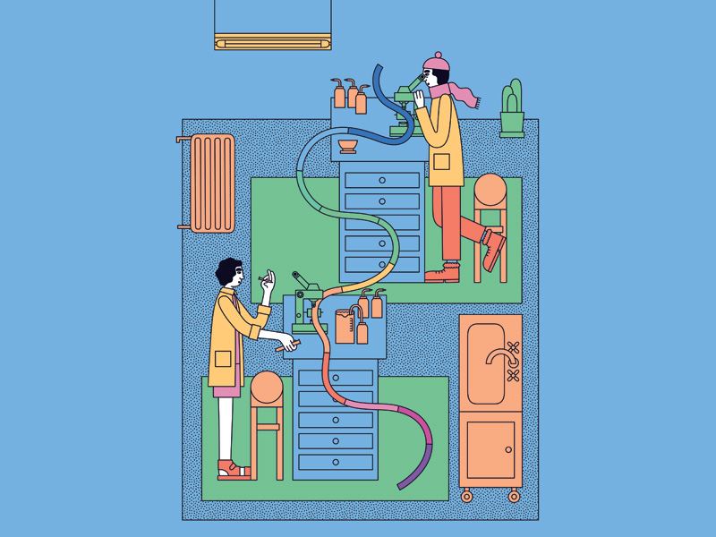
Illustration - Martina Paukova
Over the years many books, studies and various research publications have reported how colour affects our visual perception, making objects look heavier or lighter, planes advance or recede, interior spaces feel warmer or cooler, calmer or more exciting, and even sounds seem softer or louder. We know that colour can be used decoratively and symbolically based on the richness of cross-cultural customs and practices. Colour is also part of nature's survival kit for the functions of camouflage, attraction, protection or warning.
There are many extravagant claims for colour as a solution to design and architectural issues and problems, but what has actually been scientifically proved?
Colour and Psycho-physiological Arousal
In both scientific and aesthetic studies, colours have been classified and grouped in various ways. One of the most widely held groupings is that of 'warm' and 'cool' colours. Hues such as red, orange and yellow are seen in addition to their warmth, as being exciting and stimulating, whereas hues such as blue, turquoise and green are seen, in addition to their induced coolness, as being calming and relaxing. Applications based on these perceptions of colours are not confined to the work of architects and artists, but also, for example, to clinicians in an attempt to pacify or calm down aggressive and anxious patients by using blue and green colours.
In the United States, blue and green colours were used in Alcatraz before the prison was closed in the early 1960s. Conversely almost, in the 1980s and 90s, a candy pink, which became Baker-Miller Pink (named after Seattle Naval Correctional Facility directors, Baker and Miller, where they tried it out on inmates) was used in penitentiaries and later on in UK detention cells to supposedly calm down aggressive inmates. But are these decisions the results of experimentally derived data?

The design of any experiment is crucial and must take into account such variables as the age of the participants, the duration of colour exposure and the content and context of colour stimulation. Furthermore, individual differences such as personality can produce differential effects. For example, the British psychologist Hans Eysenck, has claimed that extroverts have lower levels of arousal than introverts, and that introverts are more susceptible to external stimulation. In an earlier experiment in 1986, Rikard Küller found that the heart rate was slowed down by as much as 10% in the most introverted participants. So, colour and complexity of the visual field can have varied differential effects.
Current research uses different colour stimuli and different methodologies for studying the effects of colour on humans. These are measured either cognitively or physiologically. The question of whether red is a more activating colour than blue has been studied using two different stimuli. One is colour light and measured by physiological changes in the central and autonomic nervous system and the other is colour pigment applied in interior and exterior spaces while varying the dimensions of hue, chromatic strength and lightness using photo simulation, and measured by subjective and cognitive responses.
In other experiments subjects have experienced realistic full-scale red and blue spaces where both physiological and cognitive measures are taken. Work has also been done looking at whether differences in colour (the Hue Heat hypothesis) affect our perception and feeling of warmth at the cognitive as well as the physiological level.
Rikard Küller's (1981) mammoth Annotated Bibliography of 1,700 references, commissioned by the Commission Internationale de l'Eclairage (CIE) summarised the psycho-physiological literature on colour activation, and firmly established the importance of three systems, mediating the non-visual effects of light and colour.
First, the cutaneous system activated when ultraviolet and infrared radiation reaches the skin; skin pigmentation, and the development of vitamin D are some of the main effects. Secondly, the pineal-hypothalamic-pituitary system - light affects the pineal gland where it blocks the sleep hormone melatonin, which in turn influences the hypothalamus that is involved in our emotions. Thirdly, the reticular activation system, where visual stimulation passing through the reticular formation activates the central nervous system as a whole, controlling everything from mood to motor skills.

Critics of the studies have suggested that the effect of hue on warmth and excitement is an intellectual one, involving cognitive processes, and is not based on physiological processes which affect the whole organism. In an attempt to answer this type of criticism, namely, that the effects of these colours are not only just based on stereotyped verbal associations, but that different colours actually evoke different feelings and emotions affecting the entire organism, American Robert Gerard, in his classic study in 1958, concluded that the two wavebands of radiant energy at the opposite ends of the visible spectrum -- blue and red -- exert a differential biological influence on the organism as measured by general activation in the central and autonomic nervous system (electrical brain activity, blood pressure, respiration, and heart rate). The reason for mentioning this old study here is that it was the first scientific one to use physiological measurements to study the effects of colour on people.
Further support is given to Gerard's work by an experiment carried out by Ali MR (1972). Blue and red were projected directly on the eyes for six minutes and brain activity was recorded throughout the period. The results of this study showed greater cortical arousal following the presentation of red light and lower cortical arousal following a blue light.
Parallel to these attempts using physiological measures there has been a different approach to establish the meanings people associate with different colours. This approach differs significantly from the above in that the three dimensions of colour (hue, chromatic strength and lightness) have been systematically manipulated in an attempt to ascertain their relationship to the dimensions of colour meaning. Also, the obtained data was treated by more powerful methods of statistical analysis such as factor and cluster analysis, which were not available to the early researchers.
In 1970 Lars Sivik from Sweden was the first to demonstrate, with a technique of photo-simulation, that it was not hue which affects how exciting or calming a colour is, but the chromatic strength of each hue. Later, in 1972, Acking and Küller, also from Sweden showed, with the use of perspective drawings of interior spaces, and later on in full-scale spaces, that weak colours give a room an impression of calmness, while strong colours project an impression of excitement.
There are, however, some fundamental differences between the two sets of studies. In the first two studies (Gerard and Ali) the content of colour stimulation was coloured light, while in the last two studies (Sivik and Acking & Küller) the content was colour pigment. Furthermore, in the first two studies, subjects experienced the colour light stimulation in an abstract form in the laboratory, while the last two studies were carried out in the context of real interior and exterior spaces.
These two approaches were covered in the first edition of Colour for Architecture (1976), which I co-wrote with my colleague Tom Porter. In an attempt to bridge the gap between these sets of experimental approaches I carried out an experiment with Rikard Küller, the results of which appear in the updated edition of Colour for Architecture Today (2009). In this experiment, both physiological as well as cognitive reactions of people were measured using real life spaces as opposed to colour slides or drawings. Colour pigment was used as opposed to colour light to represent the sort of spaces we actually experience for longer periods of time. The main technique used in this experiment to measure activation was through Electroencephalogram (EEG).
When a person is awake but relaxed, alpha rhythm abounds. This rather slow, high amplitude rhythm has a tendency to disappear when the person is stimulated, but returns when the person is relaxed. Too much stimulation results in continuous blocking of alpha, involving the whole nervous system, a state generally referred to as stress. Thus, by measuring the proportion of alpha in EEG, it is possible to find out whether an environment is under stimulating or over stimulating.
ECG (Electrocardiogram) has also been used as an indicator of activation and stress. ECG measures changes in pulse rate and arrhythmia-variation of heart rate of the autonomic nervous system regulating the functions of internal organs. We are often unaware of these changes because they function involuntarily. For the experiment at the Environmental Psychology Unit, School of Architecture of the Lund Institute of Technology in Sweden, two rooms were used, one red and one blue, with an adjoining control room where the monitoring equipment used for the experiment was placed.
The most important result of this study is that as far as cortical arousal is concerned there is positive support to the hypothesis that red is a more activating colour than blue as indicated by difference in delta frequency and the strong tendency in alpha. Delta rhythm is indicative of a drowsy state and characterised by high amplitude, low frequency waves; the difference between the two colours in delta was observed in both hemispheres of the brain during the first and second hour of colour exposure. As far as cortical activity is concerned the results of this experiments support, in a qualified way, the previous results of Ali (1972) and Gerard (1958) with coloured light.
In the autonomic nervous system, however, the picture is very different. In this experiment, pulse rate was higher in the blue room at 71.5 beats per minute and lower in the red room at 68.4 beats per minute. These results are in the opposite direction to the hypothesis stated by Gerard. The only other colour study which offered an alternative hypothesis to heart rate was that of Küller (1976). In observing that heart rate was slower in a colourful room than in a grey one at one-hour, two-hour and three-hour intervals, he put forward the hypothesis that cortical arousal is accompanied by cardiac deceleration. So it could be argued that strong and highly saturated colours, especially red can put the brain in such an excited state as to cause the slowing of the heart rate.
Another interesting finding is in the case of arrhythmiavariability of heart rhythm -- this was higher in response to red than blue. The combined use of variability and level of heart rhythms is a novel way of evaluating the autonomic balance, which merits further investigation.
There are several theoretical implications as well as practical applications of this research. At the theoretical level, the validity and reliability of the various cortical and autonomic measures are brought into question. The link between EEG and ECG as well as their relationship to cognitive measures is also of theoretical interest. The hypothesis regarding cortical arousal and cardiac deceleration also deserves more experimental work.

At the practical level, chromatic strength was shown to be important at the cognitive-affective level. Lars Sivik stated that 'green is no more calming than red if we compare the same saturation and lightness'. First impressions are important to architects and designers, however, longer periods of up to two hours show differences in hue affecting our body at the physiological level as far as cortical arousal is concerned. The paradoxical slowing of the heart rate and its inverse relationship with arrhythmia is not yet resolved and requires an ambitious undertaking and cooperation of several research groups.
Colour and the Subjective Feeling of Warmth
There are conflicting directives between colour connotation studies and laboratory experiments with regard to the importance of hue on the subjective feeling of warmth and heat.
Although blue is considered cold and cool, the blue of a gas flame is hotter than that of an orange or red flame. Indeed when James Turrell, the renowned American artist and psychologist, gave the keynote address to the AIC International Conference in Oslo prior to the new millennium in 1999 he made the impassionate plea to 'stop teaching the colour wheel unless you are going to teach the spectrum'. He went on to say, 'Stop teaching colour symbology. Red is not warm, and cool is not blue, it is just the opposite.'
The problem is that all the anecdotal reports claiming that red is a warm colour and blue a cold colour are strongly supported by the vast majority of the published perceptual and cognitive studies (Morgan & English 1926, Sivik 1974, Hogg et al 1979, Hutchings 2007). These studies used colour samples, simulated colour spaces in the form of colour slides and drawings, or coloured light in a variety of contexts. The correlation of their findings shows that time, taste, culture or other intervening variables could not have been responsible for the consistency of their findings.
What are the implications of these studies for the designer of the built environment? There is no doubt that the inducement of visual warmth by exposure to red light or red paint is elicited in a variety of contexts. Men and women from various cultures and various ages report this apparent warmth consistently, and as such it has direct design implications for the professional.
Architects are involved not only in designing buildings but also in creating spaces with certain perceived qualities and atmosphere. By manipulating the hue dimension they can create a space which people will perceive as warm or cold at the cognitive level.
The only study to give limited support to the Hue Heat hypothesis was by Fanger, Breum and Jerking (1977) though the difference in perceived temperature associated with colour were extremely small at 0.4°C, and was argued by the experimenters to be of no practical significance. This study, however, supports the notion that apparent warmth along the line of the perceptual studies may have some basis at the physiological level, which could be detected by the development of more refined techniques in the future.
James Turrell's strong plea to stop teaching 'colour symbology' adds another interesting dimension to the debate. Perhaps, the lack of conclusive laboratory experiments to date in support of the Hue Heat hypothesis reflects the distinguished British perceptual psychologist Richard Gregory's statement (2005) that 'there is a conflict between designing experiments simple enough for analysis and sufficiently complex to reveal the full richness of phenomena. So science is an art. Like art it is not completely mastered.'
In conclusion
There are many respectable, scientific investigations, observations and analyses on the perceptual aspects of colour and colour interactions in 2D and 3D space, however many experiments on colour connotations are awaiting further validation, and cross-cultural comparisons. We have systems of colour notation, such as the NCS based on colour phenomena and scientific colour theories, but we have not progressed far on experiments involving colour neurophysiology and experimental psychology because of the difficulties and expense involved in carrying them out and the lack of medical facilities and interdisciplinary research within university departments cooperating with schools of architecture. This is a subject which should be considered much more seriously than at present.


