PayPal gets a rebrand by Yves Behar
The world’s most recognisable online payment company has decided to rebrand just as it is repositioning itself to be more than just an online mover and shaker. It has brought in San Francisco’s Yves Behar and fuseproject to help it get its message across. Liz Farrelly looks at PayPal’s plans

PayPal has changed, but you may not have noticed. A press release trumpets: 'PayPal Unveils New Brand Identity'. While introducing Yves Behar and fuseproject as PayPal's design partners, it bigs up the sort of tiny changes to 'wordmark' and 'monogram' that are almost imperceptible to the 'public eye' (meaning the world's population minus 'industry insiders'). These brand tweaks come as PayPal goes 'mobile', offering a range of new services. But it's significant that PayPal chooses to flag up this design change in tandem with its first multichannel global campaign, as it transitions from online-only to assume a central role (it hopes) in what it terms the 'Power The People Economy' (what would John Lennon say?).

The new PayPal logo, part of the company's rebranding
Undoubtedly the PayPal logo works hard, functioning as both corporate identity and consumer brand. PayPal is a financial tool, a pioneer of the digital payments industry, so it must avoid looking fly-by-night, and anything more than incremental change may have online users doubting its authenticity (due to evermore elaborate phishing frauds). Within the retail environment, PayPal's 'PP' has to stand out among big-name brands and Fast-Moving Consumer Goods (FMCGs). Ironically, corporate identities are more prone to drastic overhauls; see for example BP's shield mutate into a sunny flower. Meanwhile, the brand marques of household names develop tweak by tweak, the remit of inscrutable packaging designers. From Coca-Cola to KitKat, recognition must not be compromised.
fuseproject tells us that the PayPal logo was too 'Web 1.0' and, 'over time it started to resemble the establishment it once challenged. Research has revealed increased user perceptions of trust, youthfulness, innovation and energy'. So, while a financial institution might emphasise longevity, PayPal aims to be forever young.

A PayPal reader, designed for regular transactions
Eternal youth is to be achieved via 'vibrant colors', dynamic angle graphic', 'softened edge' and double 'Ps' that emphasise 'connection, forwardness, PayPal's position as a visionary company... a human, approachable brand'. An accompanying video features the team doing what designers do - with pencils, paper and screens - while Behar wonders how they might 'capture the soul of one the biggest companies of our time'.
And the new identity is a tidy improvement When viewed on-screen the two-tone, nested 'Ps' suggest transparency and solidity (a neat trick). And the wordmark has a satisfying materiality; soft-edged letterforms nod to three-dimensional chamfered, stamped or laser-cut marques.
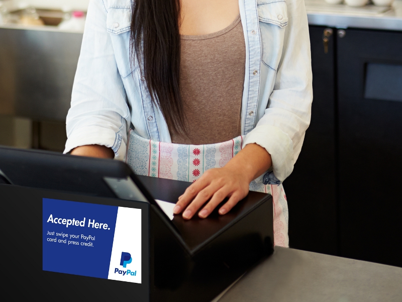
What's more exciting than any change to any logo though, are the 'transformational changes' David Marcus (ex-PayPal president, recently departed to Facebook) described in the PayPal press announcement is 'redefining the future of money by putting people first'. No longer just the go-to payment method for online indie retailing and eBay (by the way, PayPal is owned by eBay Inc), it aims to be a 'real-world' alternative to both cash and credit cards. You'll see PayPal in-store readers, and a nifty device that plugs into mobile phones used by retailers in markets and at events; and of course there's an app.
Behar deflected questions about fuseproject's involvement with such developments. Was his team involved with issues of functionality? 'We have been working on hundreds of applications and adaptations that are digital and physical...The redesign of the logo was an idea I shared with David Marcus,' he states. When asked if he's tackled customer experience, Behar stresses these are 'long-term projects' and his team is working on 'in-app brand elements and animations'.
Behar is most forthcoming when asked about buttons. 'User experience (UX) started in industrial design with interaction design,' he says, citing the button arrangement on a Dieter Rams' Braun stereo as exemplar. 'The average product experience today is a lot more complex and requires a different technical outlook...we are trying to increase the desirability to click, and thinking about the physical and virtual ergonomics is important to make a button palpable and crave-able.

PayPal logos across 15 years of evolution
'So, if Behar had the ear of PayPal's top boss and 'a full UX team on staff at fuseproject', then why limit his contribution to branding? Behar is a product designer, and even as design disciplines blur and expand it's obvious where fuseproject's strengths lie - in designing a button that wills you to press it and buy. Perhaps the full extent of his team's involvement has been downplayed because an external consultant can only do what he's asked regardless of where the ideas come from. That PayPal promotes a vision of design aligned with marketing rather than 'back office' functionality gives a clue to where design fits within online commerce. It might be doing the job, but it can be exploited for its good looks too.


