Paul Neale chooses his favourite work by Peter Saville
Intern at Peter Saville Associates for two weeks in 1987; founder of Graphic Thought Facility; sometime collaborator

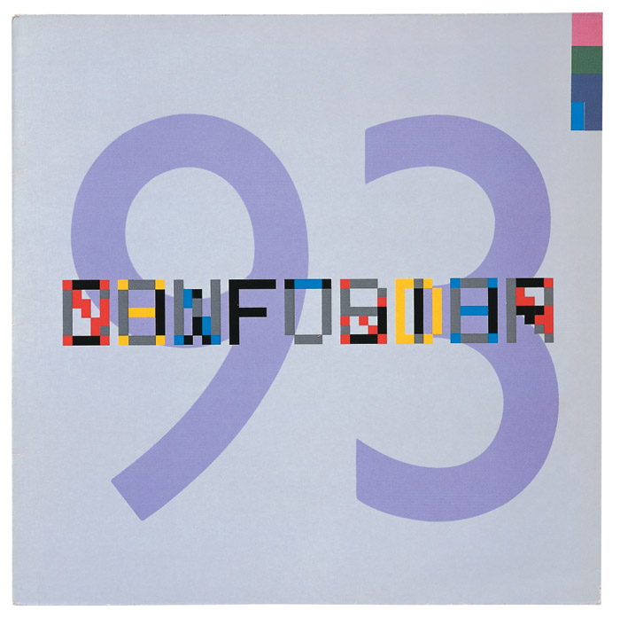
Confusion
I was part of the generation that bought everything that Factory Records released. The sleeves, as well as the music, really mattered and Peter's designs stood out. I didn't always get the references but I knew they were clever. In 1983, New Order released Confusion. I remember my moment of realisation that certain 'pixels' had been selectively debossed to pick out the words New Order and Confusion. I was so impressed I had to show it to my mum.
New Order sleeves avoided self-indulgence and self-parody, as if the record they contained perfectly paralleled the musical evolution, as it became less dark, more synthetic, hedonistic and finally mainstream. Like the music, the sleeve for Confusion is a little chopped up. Its principle components -- overprinted pixel font observed on the 'selvage' of a printer's proof, the gentle humanism of late-era Jan Tschichold typography and the pastel-meets-process colour palette -- don't make the most seamless of Saville fusions, but the tension works well and I've always liked that black F.