Office Focus: Exemplary Workplace Design
The Alzheimer’s Society’s new building in Edgbaston, Birmingham, and Cardiff’s refurbished Park House are featured as a pair of workplace case studies

Edited by Cathy Hayward
Case Study 1
The Alzheimer’s Society’s new building in Birmingham includes design features to facilitate neurodiversity, providing an environment not just suitable for people affected by dementia but a variety of other conditions. Cathy Hayward reports on Overbury’s latest project
We’ve all found ourselves lost in a building or city unable to make sense of the signs or remember the way we’ve come. We can feel confused, anxious and angry. Those are emotions familiar to people affected by dementia, who find it particularly difficult to understand signage and frequently find themselves disorientated and bewildered.
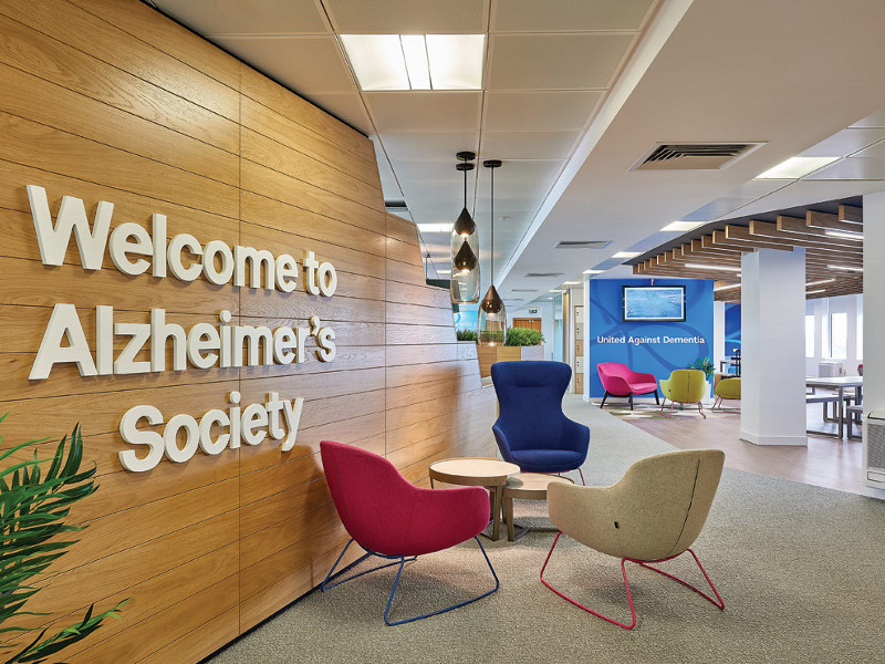
The Alzheimer’s Society’s new office space in Birmingham is a facility that complements the charity’s London HQ and regional bases and was designed to be dementia-friendly. Built to deliver the organisation’s new service, Dementia Connect, it provides a first point of contact for people affected by dementia and their families. The service is being rolled out across England, Wales and Northern Ireland, starting with Wales and the West Midlands from November, and connects people and their carer with vital practical support to empower them to independently manage their condition and remain active within their community.
 There are no dramatic contrasts with the floor finishes because sometimes people affected by dementia can perceive dark areas of flooring within a light background as a hole
The 7,250 sq ft space on the sixth floor of Tricorn House in Edgbaston therefore had to be a place where people with the condition felt welcomed and comfortable. The design team from fit-out specialist Overbury researched how interior environments can affect Alzheimer’s sufferers, working with the University of Stirling, which has conducted considerable research in this area. ‘We carried out workshops directly with dementia sufferers, which gave some invaluable first-hand information about how interior environments can positively and negatively affect them,’ explains Emily Benussi, the project’s designer.
‘The Dementia Connect facility is primarily a call centre with 90 desks, and staff there may answer some pretty emotional calls at times,’ say Benussi. ‘We wanted to design an area where the call handlers can relax, take stock and clear their heads.’ There are three meeting rooms and three break-out areas together with flexible working areas such as touchdown points and collaboration zones.
 Note the linear, timber-slatted ceiling with inset, linear light fittings, which helps wayfinding
Colour and contrast play a huge role in the development of positive interior environments for dementia sufferers, explains Benussi: ‘It’s important that the colours and contrasts used are enabling, instead of intimidating; muted instead of loud, vibrant colours. We needed to consider hues and tones very carefully to make sure they highlighted or disguised the appropriate areas of the interior space, without presenting a huge visual contrast, which can be threatening for dementia sufferers.’ For example, it was essential that there are no dramatic contrasts with the floor finishes because sometimes people affected by dementia can perceive dark areas of flooring within a light background as a hole, which can make it a difficult environment for them. Similarly, floor finishes can’t stop abruptly as that could appear as a step. Patterns, too, can be confusing to the brain so their use was limited. Having consistent colours with certain meanings in an interior environment is helpful as the colours form a reference point, and people with dementia are able to recognise the function of certain spaces through colour. ‘The process was a real eye-opener,’ says Benussi.
 The building has three meeting rooms, plus three break-out areas and flexible working zones
At Tricorn House the door frames contrast with the doors and the walls, highlighting to visitors where the cellular internal spaces are located. ‘One place in particular that we chose to highlight was the contrast in the kitchen area, where the blue of the cabinets contrasts with the white worktop, so it’s obvious where the kitchen units end and the worktop starts,’ she says. Much attention was focused on the design of this space, which poses considerable potential danger with sharp objects and hot substances. It was essential it was in no way confusing or threatening for individuals with dementia.
Additional lighting in the form of a 15mm LED strip light underneath the worktop above the cupboards was used to help people navigate their way around the units. Downlights underneath the wall cupboards illuminated the worktop, making it easier for people with impaired sight to see what they are doing when making a hot drink or preparing food. No glossy surfaces were used, to reduce the chance of confusing reflections, which can pose a visual threat. Even the splashback tiles are matt.
 Colour and contrast play a huge role in the development of positive interior environments for dementia sufferers
While integrated appliances are standard in most workplace kitchens, at the Alzheimer’s Society the fridge is free-standing so it can’t be mistaken for another cupboard or storage unit. At the same time, the panels on the cupboard doors are perforated to ensure that people can see exactly what is stored there, avoiding the need to search through numerous cupboards or remember where things are kept.
All of the workstations in the new building are located next to external windows, maximising their exposure to natural light, and all of the internal spaces have internal glazing so that the beneficial effects of natural light pervade throughout. ‘It was important that every single space in the office benefitted from natural light, and so the floor plate was kept as open plan as possible,’ says Benussi.
The internal fixtures and fittings, such as signage, have a huge role to play in how a person with dementia navigates the space. The signage had to be clear with a good level of contrast so that text can be read easily and without confusion, while, for example, not using white words on a glass wall made all the difference. Tactile and 3D signage was also used, together with signage within enclosed spaces, such as the storeroom and toilet, clearly showing the way out of a space.
Other wayfinding is less obvious. Key focal spaces were designed as reference points for visitors. The tea point has a feature ceiling – a linear, timber-slatted ceiling with inset, linear light fittings – which can be seen from all over the office, ensuring it is easy to navigate to. The collaboration booths also have two, large, pendant lights that can be seen from each end of the office.
There is a deliberately strong homely feel throughout the space as domestic furniture tends to be better for dementia sufferers, explains Benussi, who adds: ‘As well as the traditional soft seating for the office breakout and reception space, we chose seating of various heights as it was important that visitors – many of whom are elderly – do not struggle to get in and out of chairs.’
Just as biophilic elements in a workplace help improve people’s wellbeing, they can help to calm those affected by dementia as well as provide sensory stimulation. The elements include planters along the tops of collaboration booths, potted plants throughout the space, and the use of natural materials, tones and colours.
The result is a space that is welcoming and supportive for people affected by dementia who may be guests, while also providing a caring environment for the staff who may experience distressing calls and visits. It’s a truly multisensory space, designed around consistency, comfort and wellness, which many other offices could learn from.
Project file
Architect/Designer: Overbury
Fit-out: Overbury
Engineering: Overbury
QS: Cluttons
Project managers: Cluttons
AV: Overbury
Furniture: Overbury
Designing for Dementia
Good design should support people affected by dementia in three key areas:
Cognitive ability is improved by promoting the use of familiar and recognisable surroundings and activities that respond to peoples’ deepest and earliest memories.
Social ability is addressed through the design of artefacts and amenities that create opportunities for people to interact more easily in activities of daily living.
Physical ability is promoted through design that unobtrusively compensates for disabilities, such as mobility and vision, which are prevalent among people affected by dementia.
Source: Design for Dementia, a two-year collaborative research project between the Helen Hamlyn Centre at the Royal College of Art and Bupa
Case Study 2
Cardiff’s Park House is a wonderful example of how often refurbishment is a much better, sustainable long-term solution to regenerating a city centre than knocking down and building from the ground up. Angela Penn reports
Cardiff boasts the UK’s fastest-growing population, and as business title Management Today recently found, is one of the top seven cities in the UK in which to do business. With an unusually young population – the majority are under 35 – it has seen internationally competitive clusters emerge in many sectors, including financial, creative, life sciences and advanced manufacturing.
 The entrance seating was used to set the tone for the rest of the scheme
As the Welsh capital, business in Cardiff benefits from being in the home of Welsh Government, while the demand for high-quality workspace has recently been exacerbated by the high cost of offices in London and the consequent exodus of companies to regional hubs. As businesses relocate, some cities struggle to ensure there is enough high-quality space. First impressions count when attracting potential businesses and individual occupiers so the importance of place and in particular the entrance and façade cannot be underestimated.
So the core of the brief by developer Boultbee Brooks was to update a tired and dated 1950s office building to meet today’s requirements. Park House is central, in a prominent area close to institutional buildings including the university. It is situated in a conservation area and also surrounded by three parks. Occupiers include Liverpool Victoria, Gleeds, Medigold Health, Cowshed and Scott Brownrigg.
Architecture and interior design practice Gpad was directed to keep the layout yet reimagine the common parts. This included the entrance, corridors and courtyard, with a design for the offices to be implemented as they become vacant. The exterior was to be updated and opened up to enhance the streetscape.
 Offices were updated as they became vacant
The team completely refreshed Park House with a bold colour scheme and geometric features to create a modern and sophisticated feel. Four floors of sleek, contemporary offices are connected by an eye-catching, refurbished central spiral staircase encased in a circular glass wall. Bringing the outside in, the glazing allows for views at every floor into the central courtyard, which is now a versatile outside area for working, collaborating and relaxing.
The entrance seating was used to set the tone for the rest of the scheme. With a restricted area to work with, creating a dynamic space presented a challenge. The brief included a large screen to grab the attention of staff and visitors and to drive a perception of an original brand identity. To bring this to life yet avoid expensive and overused solutions, Gpad undertook thorough research into the possibilities. The scale of the space was not right for a large screen simply projecting images. So, inspired by the light art installation Shaida Walking by Julian Opie in Carnaby Street, Gpad decided on the LED screens produced by Swedish company Nullohm. Sensors placed at the back of the reception capture the movements of visitors and staff, projecting their shapes in real time onto the LED lights of the dark screen.
Another challenge was how to make the small seating area flow and feel spacious yet dynamic. A set of angular shapes was introduced, and these were applied to the floor, the walls and the ceiling. Keeping the colour scheme simple was also key, and only blue was added to an initial monochrome palette. Intersections between blue and white wall panels form a network of triangular, three-dimensional shapes on the walls. Giving definition to the design, the sleek painted panels with a contrasting black edge provide a counterpoint to the rough finish of the Valchromat.
The existing reception desk was clad with Hi-macs, echoing the shapes of the joinery. The desk appears to flow seamlessly through the front glazing, becoming a flowerbed outside. Unifying the space, the pattern continues on the ceiling, as the wires of the light pendants form to create an eye-catching geometric network.
The installation of the joinery presented another challenge. The Valchromat shapes, while individual and irregular, had to be exactly right for the intricate pattern to work. This involved a detailed design process and also required the architects to work closely with the contractors on-site.
 The existing reception desk was clad with Hi-macs, echoing the shapes of the joinery. The desk appears to flow seamlessly through the front glazing, becoming a flowerbed outside
Upstairs, the futuristic concept continues. Gpad wanted to add to the sense of height in the corridors, creating an unusual combination of a suspended and a mesh ceiling. The suspended part closest to the lifts allowed for the insertion of projecting, semi-recessed spotlights. For the other part, an existing tile system was reused and infiltrated with black mesh, creating more height and adding a dash of the industrial aesthetic.
The spiral staircase connecting the building was updated and brought in line with the new concept and colour scheme. The finishes were updated – the timber varnished, the metalwork painted and the contrasting nosing installed. The number of each floor is cut into the vinyl flooring, in the same font as the new building sign.
Park House is a prime example of where a structurally sound building simply needed a facelift to bring it up to modern-day requirements. From a sustainability point of view, a refurbishment is fundamentally a much better long-term solution than knocking down and building from scratch. Any new build in a similar conservation area would have met with planning restrictions, greatly increasing the time in which new workspace could be turned around from conception to completion.
Reimagining the existing building was therefore the right approach in this Cardiff location. An example of the increasing number of high-quality workplaces outside of the capital, Park House is sustainable, sleek and has features promoting the wellbeing expected by today’s employees.