Nissen Richards Studio / The Courtauld Gallery, London
The Courtauld Gallery now guides visitors using unique colour schemes and design that blends contemporary and historic aesthetics

Words by Emily Martin
Images by Gareth Gardner
PROJECT INFO
Project size: 1,500 sq m
Duration: August 2017 – December 2021
Budget: Confidential
Client: The Courtauld Gallery
Exhibition design and bespoke showcases: Nissen Richards Studio
www.nissenrichardsstudio.com
Signage and wayfinding: Nissen Richards Studio
Base-build architects: Witherford Watson Mann
Lighting design: Studio ZNA
THE COURTAULD GALLERY has re-opened after the biggest redevelopment since it first moved to its magnificent 18th-century home, Grade I-listed Somerset House in the Strand, in 1989. Architect and designer Nissen Richards Studio was charged with the interpretation of the new visitor experience for the project, considering the entirety of the visitor journey from arrival, through all three levels of gallery space, culminating in the extraordinary LMVH Great Room. The remit included the scheme’s gallery and exhibition design – including a brand-new interior colour scheme; bespoke visitor furniture and artwork showcase design, as well as the project’s wayfinding and signage. The design team also worked closely with its key partners to deliver a scheme that has had incredible attention to detail put into it, as well as overcoming some major challenges.
‘Designing a visitor experience is like a complex puzzle, where we need to spend some time breaking down all the component parts and then putting them back together so that there is a coherence,’ explains Pippa Nissen, director of Nissen Richards Studio. ‘We spent some time looking at best practice and benchmarking on our own and together with the client, including a study trip to Paris. This was an opportunity to tour other venues such as the Louvre, and other similar, traditional historic town house galleries that displayed paintings in an intimate way, looking as a group, including the client, at what worked and what didn’t work so well. We took this information back to our studio and worked through the details.’

Nissen Richards Studio’s signage and wayfinding
Nissen Richards Studio’s approach began with a consideration of the physical aspects of the environment, including the complexity of spaces and the way visitors experience and flow through them. Computer modelling was used to map visitor flow forensically, from street level into the entrance hall and then through the 13 individual gallery spaces.
‘This is at the centre of what we do – creating an overall background that gives an atmosphere, which has an emotional impact for the visitor,’ says Nissen, when I ask her about meeting the contemporary needs of people within an old building. ‘This was very much part of the brief and relates to a lot of visitor testing in the original Courtauld spaces. The feedback was that people liked the personality and intimacy of the original building. It didn’t feel like an anonymous contemporary building.’

Concealed storage based at the new reception desk
The result is a palette of materials that is both contemporary and historic. Looking around you will see metals, timber and paint finishes all in a series of tones to complement the pre-existing space.
‘Our aim was to clear the spaces of visual clutter and create a very natural and coherent feel with light and materials leading the visitor through the spaces. Working on the wayfinding enabled us to choose materials and configurations that worked very closely with the rest of the interpretation, so that they were all pulling in the same direction visually; a consistent and subtle language,’ says Nissen.

View down the main staircase
The design of the new arrival area includes a new matt Corian reception desk with concealed storage and a stepped design. A new display wall to the right of reception for exhibition catalogues uses lipped-detail timber. A queue divider furniture element on casters breaks up the space and is a subtle way to help direct arriving visitors. A feature floating light above is one of several major new feature lights in the scheme, deliberately contrasting with the minimal track lighting in the galleries.
Other new bespoke furniture includes benches throughout the galleries and at key rest points, such as by the lifts. The benches are in oak, specially matched to the gallery’s floorboards, with a butterfly profile and wide, generous feel. The metal frames supporting the benches make them heavy enough to be stable, while light enough to allow for repositioning.

Art illuminated by Studio ZNA’s lighting
Bespoke showcases were developed throughout by Nissen Richards Studio and manufactured by Florea d.sign, with a ‘family’ of cases for each gallery, made up of plinths in cool white Corian, on non-reflective glass cases and shelves, depending on the art being displayed.

A queue divider furnishing element helps the room stay uncluttered and simple
Signage uses Canson paper, which has a long association with the world of art, and is slotted into patinated brass holders. The new wayfinding is made from Corian, which combines craft and technology to give the right finish. Nissen says it’s one of her favourite features of the scheme with the practice working closely with Factory Settings and Corian on numerous tests and prototypes.

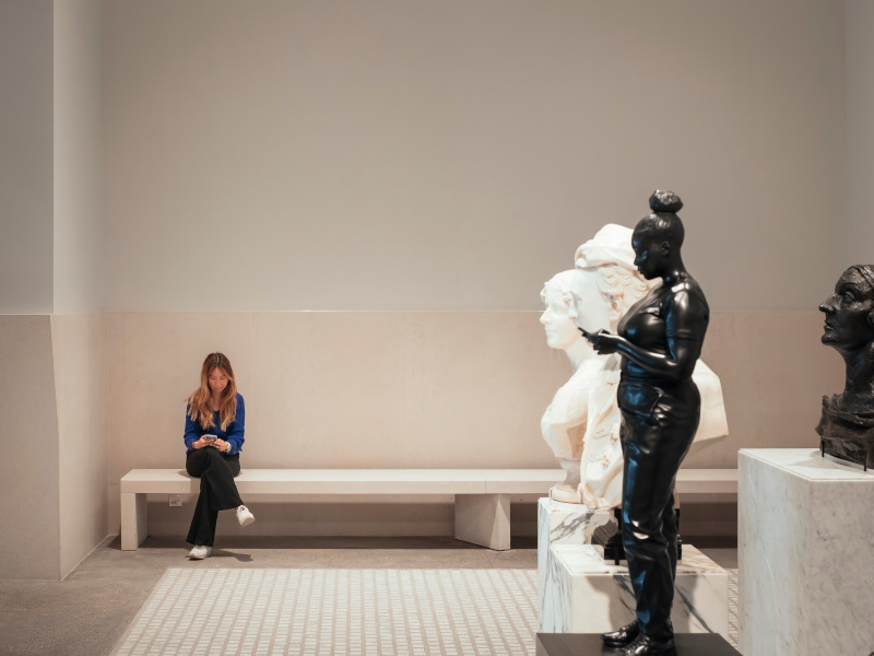
The design ensures an intimacy with the artworks was maintained
‘We were able to create a new process for us, that was both artisan and felt crafted, which feels appropriate for The Courtauld,’ she says. ‘We etched using state-of-the-art laser-cutting techniques, but worked with a French polishing bar that was melted and worked into the etching… [it] took several goes to get [it] just right; but then once they were right this could be rolled out. The beauty too is that they can be touched up on-site, so the natural wear and tear over the years can just be filled and repaired. I am really proud of this work, as we worked with local suppliers and craftspeople to create something new.’
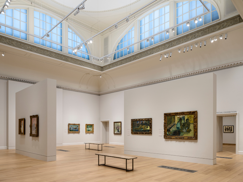
Nissen Richards Studio also created the new paintwork colour scheme throughout the interior spaces, taking inspiration from the artworks themselves. These range from the domestic-inspired warm colours of the Bloomsbury Room to the lighter pinks and blues of the Blavatnik Fine Rooms, working in each case with the proportions of the galleries, the ceiling height, the nature and colourways of the artworks and the north or south-facing light.

Freeform dividers allow for an unhindered flow of visitors
The practice worked with paint manufacturer Little Greene and its colour historian to test and create bespoke colours for the gallery space. It introduced a new ‘lighter, lower, brighter’ colour used across all the galleries.

Discreet lighting was carefully integrated within the heritage ceilings
‘I really enjoy the calmness of the colours that we used, so there is a consistency across all of the spaces, as well as shifting wall colours,’ says Nissen. ‘We worked hard to test colours both in the different orientations, as some of the galleries face north and others south – so that there were extremes in lighting conditions. We were also very keen that the extraordinary views across Somerset House and the courtyard below could become part of the experience.’
A calming off-white dado level throughout provides a clear linking element, with the walls themselves holding the colour to work at their best with the art in each of the key areas – the Medieval Room, Blavatnik Fine Rooms, Bloomsbury Room and the LMVH Great Room. For the hang of the paintings themselves, stainless steel wires were used, which stand proud of the galleries’ historic walls and were spray painted to blend in seamlessly.

From blue to pink with unique colour palletes tailored to each room
The practice, along with lighting designers Studio ZNA, used lighting as a guiding tool to help direct visitors, as well as to optimise the display of the institute’s world-renowned collection. A new track layout has replaced the individual lights previously attached to artwork frames and was carefully integrated – with on-site testing undertaken to ascertain optimum distances – within the decorated heritage ceilings to allow visitors to appreciate longer and more unobstructed vistas.
‘We worked closely with Studio ZNA to test different light gauzes to block light but allow the view through still. The result is that light levels are now more continuous and are supplemented in an invisible way with lighting that is no longer from central chandeliers, but from new tracks able to create consistent light across the works on the walls and objects in cases,’ explains Nissen.
The LMVH Great Room, on the top floor, forms the final crescendo to the new visitor experience. Nissen Richards Studio played an integral role in realising the bold new vision for this room, developing freestanding divisions and opening the room up after years of being partitioned into smaller, more cellular spaces.

A display table angled for ease of sight
The space was another major challenge for the practice: how to enable more works to be shown here, without compromising the overall space? Nissen explains to me that over the years the Great Room had been filled with smaller structures to create more wall space and break down the much larger void. However, as part of the base-build strategy, The Courtauld wanted to re-open this beautiful and dramatic space.
‘We spent some time thinking about different options of how we could put in walls within this space, that were somehow less present in the overall space,’ she says. ‘In the end we tested this in several different ways – both through computer modelling options, and then building large 1:25 models with scale versions of interventions. Finally, we created 1:1 mock-ups in the space with Factory Settings, a theatre contractor, using large-scale scaffolding and surfaces. The final design uses individual walls supported from the base, plus pop-out walls that give the illusion of implied rooms within the larger space, allowing for both intimacy and larger moments’.

Portrait of Margaret Gainsborough on a freestanding furniture display
The new configuration takes the form of a series of continuing spaces, which control flow and allow for a more intimate experience of the artworks, while retaining the experience for visitors of a single volume. Four new walls create a dynamic final setting within a layout that breaks up the conventional gallery perimeter wall hang and is completely visible from the point of arrival. This ensures a sense of discovery for visitors, allowing the collection to be viewed in defined groupings, each with equal prominence.
‘The programme meant that our most intense period was through the pandemic. The main work with the showcase manufacturer was in this time,’ recalls Nissen. ‘The showcases were incredibly complex – and we wanted them to appear as invisible as possible. We wanted to use the same palette as the wayfinding and interpretation and furniture, but also be able to hit conservation grade cases – which is no mean feat!’

Patinated label holder with Canson art paper label
By switching to Zoom and Teams, Nissen Richards Studio worked with Florea d.sign in Romania via remote meetings – which were slow – going over prototypes in the workshop. The practice also continued to work with samples by sending them out to people in their different locations, including the curators, in order to continue meetings online and sign off finishes. While this process was inevitably longer, it nevertheless crucially kept the project moving.
‘So, even with the huge hurdle of the lockdown and working from home, we created the showcase details, and I believe that they are unique and really beautiful, and not compromised at all from this working process’, adds Nissen.
‘Working closely with the project team and curators, we have created an engaging environment with elegant displays, enhanced within the historic setting. Everything supports the Gallery’s ethos of enabling unhurried and personal enjoyment of great masterpieces within a distinctive environment, while encouraging the public to foster deep encounters with the breadth of the collection and the history of Somerset House. We very much look forward to seeing visitors enjoy the galleries and the artworks for themselves.’
KEY SUPPLIERS
Showcase manufacture: Florea d.sign
www.florea.de
Bespoke paint colours: Developed with Little Greene
www.littlegreene.com