Light+Tech: Verner Panton’s Lighting
Lighting expert Jill Entwistle takes an in-depth look at the work of influential designer Verner Panton on the 60th anniversary of his Moon Pendant

Images Courtesy Of Verpan
Words by Jill Entwistle
This year marks the 60th anniversary of Verner Panton’s Moon pendant. Designed in 1960, it represents one of his earliest light fitting designs, only his second after the Topan lamp (1959). Last year saw the 50th anniversary of the futuristic Globe (1969), another of his iconic luminaires. Panton was a talented, extraordinary individual who cut a provocative swathe through conventional Scandinavian design. Literally a colourful personality, his bold experiments with light, colour, form and material, especially plastic (he developed the first inflatable furniture from transparent plastic film), marked a definitive break from Danish modernism with its muted monotones and natural materials.
‘The main purpose of my work is to provoke people into using their imagination,’ he once said. ‘Most people spend their lives living in dreary, greybeige conformity, mortally afraid of using colours. By experimenting with lighting, colours, textiles and furniture and utilising the latest technologies, I try to show new ways, to encourage people to use their fantasy imagination and make their surroundings more exciting.’
 Verner Panton’s futuristic Globe (1969)
Panton was born in Gamtofte, a village on the Danish island of Funen, in 1926. His father did not approve of his ambition to become an artist, so Panton compromised by studying architecture at the Royal Danish Academy of Fine Arts in Copenhagen. He graduated in 1951 and after a couple of years working at Arne Jacobsen’s studio – he learned more from Jacobsen than anyone else, he said later – set up his own design practice in 1955.
 The Moon pendant was Panton’s second-ever design
Unlike another great Dane, Pøul Henningsen, with whom Panton worked in the early years – he was taught by Henningsen at the Royal Danish Academy and started by designing lamps for Louis Poulsen – his luminaire designs are extraordinarily diverse. What they have in common, of course, is that like Henningsen’s creations for Louis Poulsen, they show a profound grasp of how light works and how it can be controlled by the lines, structure and materials of the luminaire. He designed the Panthella lamp for LP in 1971 – an elegant mushroom, its hemispherical acrylic shade and slim stalk both producing homogeneous, diffused illumination.

Panton, who passed away 22 years ago, is considered one of Denmark's most influential furniture and interior designers
Moon is another lesson in light control. Its fan-like design features 10 ring-shaped aluminium lamellae perfectly positioned to provide a soft, ambient and glare-free illumination. The blades reflect and filter the light, while the pendant changes its appearance depending on the angle at which it is viewed.
The transparent acrylic sphere of the VP Globe could clearly have created a glare problem but the pendant features five reflectors of polished aluminium with two accent colours, each suspended by three steel chains. Through them the light is managed and modulated.
 1977’s Onion lamp was made originally for Japan’s Yamagiwa
Panton’s 1977 Onion lamp, originally for Japanese company Yamagiwa, is as the name suggests inspired by the curves and layers of an onion bulb. Strips of metal curve round the concealed lamp while acting as reflectors to softly diffuse light.
The Fun collection of lamps (1964) reflect Panton’s affinity with the sea of his childhood home. The Fun pendant is a carefully shaped cascade of hand-cut mother-of-pearl discs that sway gently in the breeze. They reflect light to give off a warm illumination, but still shimmer under natural light when switched off. Installed in groups they create an extraordinary effect.
 The Fun lamps feature hand-cut mother-of-pearl discs
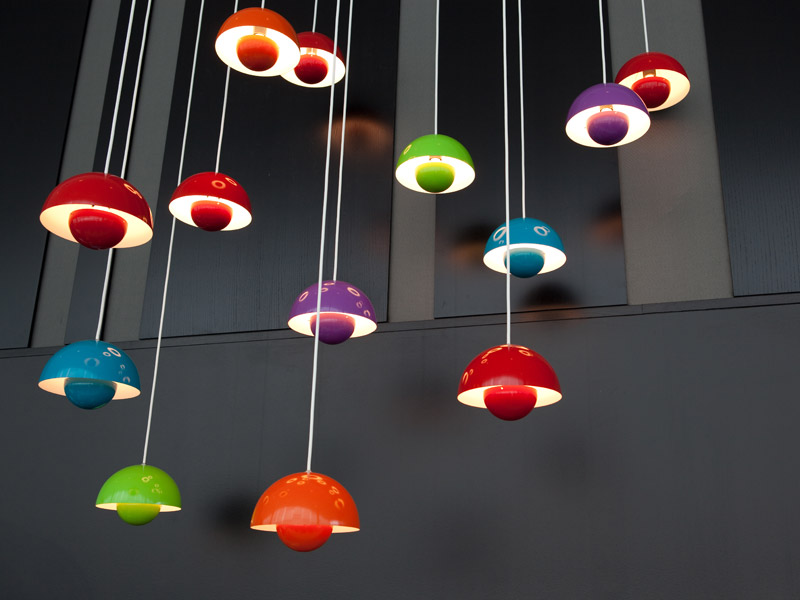
While his furniture and especially his interior compositions – gesamtkunstwerk (total artwork) – fully embraced an often vibrant, Pop Art, surreal, psychedelic vibe, his luminaire designs were therefore often more nuanced, although Flowerpot (1968) and Wire (1972) positively pop with shiny plastic primary colour.
He certainly believed that light and colour were closely linked. Flowerpot, for example, is designed so that a concealed lamp bounces light off the interior coloured surfaces of the hemispheres.
 Dating back to 1972, Wire makes use of primary colours
‘The colours can make a crucial change in nature, if you switch from daylight to artificial light or just from strong to weak illumination,’ Panton said. ‘In addition, colour perception is affected by the material structure. Even if a piece of textile can have the same colour as a shiny enamel plate, then they will act completely different.’
In the clamorous, colour-immersive experience of his seminal building for German newspaper Das Spiegel – a firework display of ‘geometry and colour, murals, glass and glimmering light’ according to the Spiegel’s internal newsletter in 1969 – Panton designed a swimming pool for the employees. The interior was dark, but multi-coloured ranks of his famous Spiegel panel fittings on the ceiling reflect coloured light on to the moving surface of the water. ‘Swimming here would have been a psychedelic experience, like swimming in light,’ observed John Engelen, writing for De De Ce Blog.
 The Ball pendant is made from Cellidor thermoplastic
Panton will probably be best remembered for his furniture, notably the Panton chair, a slink of sleek plastic. It was introduced by Vitra (long-time Panton collaborators) in 1967, and memorably rekindled when Kate Moss posed naked on it for a Vogue cover in 1995, triggering something of a revival of his work, which had languished for a while in the unfashionable doldrums. Then there’s the gravity-defying S Chair (1956/65) and the unsettling Cone Chair (1958/1960) and Heart Cone Chair, achingly simple, elegant forms that pirouette on a point.
His lighting is not far behind though, benefitting from both a classic, timeless design in some cases and a retro appeal in others. But ultimately they should endure because of Panton’s understanding and mastery of light.
verpan.com


