Lighting Focus introduction, and BDP's Mark Ridler on lighting interior surfaces
Mark Ridler, Lighting Director at BDP considers the essential relationship between those choosing an interior surface and the people lighting it

Edited by Jill Entwistle
‘Architecture appears for the first time when the sunlight hits a wall. The sunlight did not know what it was before it hit a wall.’ That famous pronouncement by architect Louis Kahn, who had a profound understanding of illumination, encapsulates the essence of the relationship between light and materials, light and architectural space. He is talking specifically of natural light but, of course, his words apply equally to artificial lighting.
The crucial interplay between material surface and lighting should be at the heart of interior design. As Mark Ridler of BDP says in the article below: ‘There is an intimate interdependency between those responsible for choosing the surface, those responsible for the ingress and play of natural light, and those designing the artificial lighting.’
Such is the complexity of lighting and its transaction with its surroundings that it involves a range of considerations if a space is to be functional, visually pleasing, and full justice done to the materials, textures and colours that compose it. It is those considerations that form the core of this Lighting Focus.
Reflections on Tonality, Mark Ridler, BDP
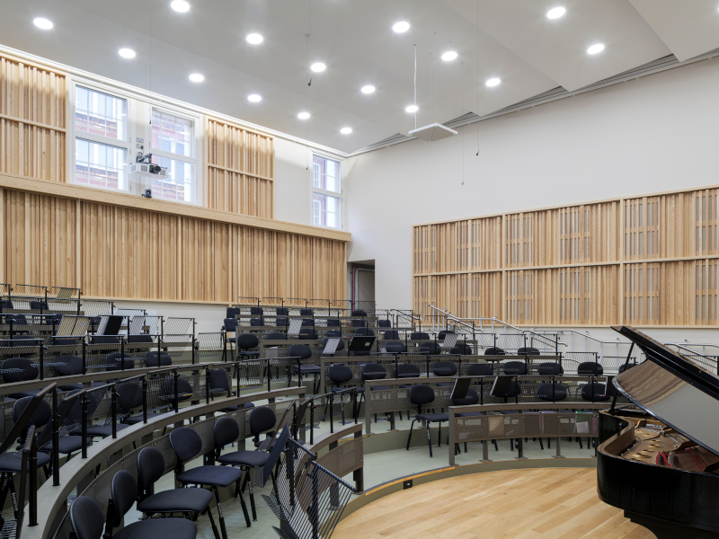
 The Smythe Library, Tonbridge School, Kent, with lighting by BDP. Creating a lit effect while concealing the light fittings involves integrating equipment into architectural details and then reflecting the light off a surface. The material’s reflectance is critical for both appearance and performance
‘You can’t make a black wall white, no matter how much light you chuck at it.’ It always surprises me how often I have to say this in design meetings (and in mock-ups, and on site), but I believe this is due to a profound misunderstanding about the importance of finishes and the role of tonality (as opposed to colour or texture).
Brightness is a function both of the reflectance of a surface (tonality) and the amount of light falling on it. Contrast is the relative brightness between juxtaposed surfaces and is essential to the visual comprehension of the form (scale and shape) of any space. What is clear is that there is an intimate interdependency between those responsible for choosing the surface, those responsible for the ingress and play of natural light, and those designing the artificial lighting, and they may be any combination of architect, interior designer, lighting designer and electrical engineer. For the purposes of this article I assume that those responsible for surfaces are interior designers and those for light are lighting designers.
Contrast is an interdependency between surface and light, and so this means that any problems in contrast cannot be solved either by the interior designer or lighting designer alone – they have to work together. More positively, collaboration presents an opportunity: by working together they can bring harmony and atmosphere to a space, making it both effective and attractive.
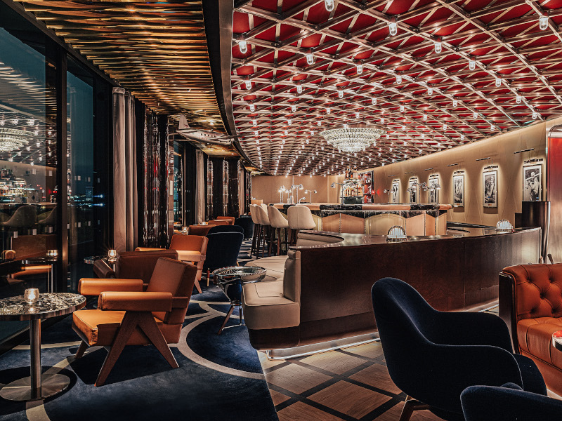
 A lighting concept for a bar by BDP. A lighting designer will conceive a space in terms of brightness, collaborating with the architect or interior designer to determine its feel and purpose, looking at the visual hierarchy and how to work with the surfaces and their finishes
There is a human physiological principal of positive phototropism, much used in theatre and retail, where the eye (and attention) is drawn to the brightest part of the visual field. It’s why we light shop displays three times more brightly than shopping malls, an actor’s face is the brightest object on a stage, and much contemporary dance is performed in a black box. Note that this is a function of contrast, not absolute brightness. A product in a shop can be lit to 1,000 lux but if it is a dark object on a light surface it will always appear dark. Similarly, a light object on dark surface, such as in a jeweller’s, will sing even if lit to a much lower light level.
 At the Court of the Lions, Alhambra, the architects converted the harsh desert sun into soft interior light by reflecting it twice: once off the white external paving and then off the butter-coloured stucco ceiling
Contrast is also essential in determining shape. For instance, an edge between two surfaces can be perceived if one surface is brighter than the other. In the Westgate Oxford shopping centre, for example, the skylights are distinguished from the apse by a difference in brightness. Both are painted white but the difference in light intensity (naturally in daytime and artificially at night) defines the form. If they had been black, then in both conditions the form would have been disguised.
Certain architects embrace this intuitively. If you look at the work of Steven Holl, light and contrast are integral, and how natural light conveys the form and genius loci of the project. The architects of the Alhambra in Granada reflected light twice (off the white external paving and then the butter-coloured stucco ceiling) to convert the harsh desert sun into soft, delicious, internal light.
 Contrast of 1:2 is essentially perceived as even
An artificial technique that we and many other lighting designers use is lighting without light fittings. It is much favoured by architects and interior designers because it offers the lit effect while masking the technical kit. It involves integrating equipment into architectural detail and then reflecting the light off a surface. Here, the reflectance of the material is critical not only in terms of appearance but also in terms of performance. For example, I once lit a hotel toilet entirely indirectly with the agreement of the interior designer. Unbeknown to me the ladies had been finished in gold and the gents in grey. Not surprisingly – although it did surprise the interior designer – one was three times brighter than the other on site. It was rectifiable, but only by re-specifying (thus incurring extra cost/delays) and using more energy.
 Contrast of 1:3 is gentle and will establish a visual hierarchy
This is particularly important in working environments. We frequently, and intentionally, use a combination of direct and indirect lighting. This is because direct lighting, judiciously applied, is a low-energy way of providing task light, and the indirect component dresses the space and provides great facial modelling. It relies, however, on light ceiling tones. You can choose to have darker finishes such as raw concrete, but this absorbs 70 per cent of the light and makes the building inefficient. Or you can choose to light only directly, but then task shadows become more defined, faces more severely downlit, and the space will appear harsher. If you choose a black ceiling then the contrast between the light fitting and the adjacent darkness will create glare. Permanently, in the peripheral vision, a highcontrast artefact will be drawing your attention from the task, resulting in repetitive micro eye movements, distraction, fatigue and headaches. It’s not that you can never use black ceilings. It might be entirely appropriate in a retail or leisure setting, but it must be done knowingly, with an understanding of the impact both psychologically and physiologically – or, alternatively expressed, understanding the interplay between form and function.
 Contrast of 1:10 is dramatic
So, who can help in this interplay? If the light levels are ‘engineered’ with no reference to finishes this will result in the efficient provision of even illumination to a theoretical horizontal plane, and with no consideration (unless in an office) of ceiling or vertical surfaces. It will be the equivalent of the Revit grey box. This means all responsibility to manage contrast falls on the finishes. They will need to work very hard to meet the technical brief, create atmosphere, and define form and visual hierarchy. It’s done a lot and sometimes very successfully – however, the design is ‘dancing on one leg’.
 Contrast in excess of 1:20 is considered a potential source of glare, although that depends on the human activity (consider the impact on office working versus a walk in the woods)
If a lighting designer is involved then they will immediately conceive the space in terms of brightness and be keen to collaborate to discover the feel and purpose of a space, its narrative and context – and, to that end, work with the architect or interior designer to explore the visual hierarchy and how to work with the surfaces and their finishes to create the desired result.
There was a commercial HQ in Canary Wharf I designed some years ago that required lighting to be tendered before the finishes package. I told the client that was not ideal, but okay, as long as they didn’t clad the walls with stainless steel or a dark, polished marble. A year later I had a client screaming at me from a mock-up where the ‘lighting was terrible’. I asked about the finishes and, sure enough, they were 50/50 stainless steel and a beautifully polished darkolive marble. We as architects, interior designers and lighting designers need to think about finishes earlier than we habitually do. Finishes are so much part of the character of a space, and in particular the tonality; they are so essential to the perception of form they should be key to the conceptual approach. Holl’s concept drawings are an exemplar. If we think conceptually about a space purely as a white card model, then finishes become merely decoration. We should not be doomed to repeat these mistakes of the past but instead seize the opportunities they present.