Workplace design - three of the best new projects
Three case studies show how a move to a new location, going hand-in-hand with creative planning and design, has given a real boost to the businesses’ staff.

Words by Cathy Hayward
Enterprise Area Sq, Sketch Studios
Three case studies show how a move to a new location, going hand-in-hand with creative planning and design, has given a real boost to the businesses' staff.
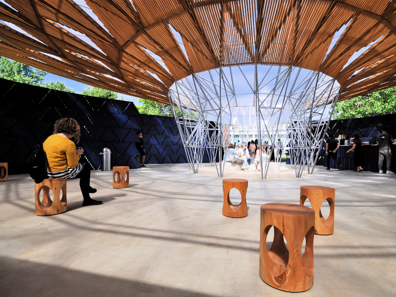
European Offices of large American businesses can often be a chip off the ol' block - a replication of an American design. But that could lead to a clash between differing business cultures. How to avoid this clash while being in step with the company's values and business culture was the problem facing Matthew Folkemer, European corporate operations manager for Enterprise Car Hire. Folkemer was in charge of transforming Enterprise's recently leased building on the outskirts of London into the company's European, Middle East and Africa HQ.
Some 350 employees moved into the 3,700 sq m leased building in Egham this spring, following a 16-week renovation. There's room for many more people, says Folkemer. Enterprise owns a low-rise building adjacent to the rented one, in which it occupies half a floor and is renting out the rest of the building until more space is needed. Although built only in 2000, the three-storey leased building was already 'tired' when Enterprise signed the lease in 2013, knowing that a renovation was needed.
Enterprise had moved into the UK and Europe market in 1994 and Folkemer, right out of university, followed in 1997 after working for three years at Enterprise in St Louis. The company had always grown quickly and its employees had had to work in several locations, including previously in an isolated industrial park near Egham. Folkemer knows the American and British-based business cultures well. Even so, the design for the new building was a leap of faith for him: he'd had a lot of experience designing showrooms for customers around Europe but little designing office space for employees.

Break-out lounge and eating areas are located at the entrances to floors
Folkemer also had to sell the design to the highest powers in the family-owned and run business back in the USA. But the company's values actually lent themselves to exploring a new working environment, he says: 'Enterprise has always put the health and interests of its employees and customers above the financial bottom line.'
'The building had a lot of closed-off cellular offices of differing sizes and shapes. People sitting in the core had very little natural light,' says Folkemer. There were a lot of 'cheap partitions and wavy moveable panels' that designated working spaces. There also was no central stairwell. People bumped into each other only when using the slow lift or the two dark stairwells at opposite ends of the building, which doubled as emergency exits. 'Basically, it was an old-style environment where employees got bigger private offices as they were promoted. I was looking to take politics out of the office space,' he says.
For the refit project, Folkemer teamed up with two companies from the Fourfront Group - Area Sq did the design and fit-out and Sketch Studios did the furniture and move management. The design had to complement Enterprise's long-term growth strategy. The business has expanded into France and Germany and started franchising operations into smaller European markets. Now, with the UK operation as the major EMEA HQ, the office was going to see a lot more movement of employees from around the Continent and coming in from USA.
'The new design was to give people a better office space but also a more efficient one. It was an attempt to swing us away from cellular work pods, cube furniture and panel dividers that set out sweeping workstation for a single employee. The goal was to encourage more movement, more collaboration, more communication,' he says.
'The building remains much the same layout except for the new central stairwell,' says James Geekie, head of design at Area Sq. 'Also, sustainability was high on the client's agenda, so an energy efficient HVAC (heating, ventilation and air-conditioning) system was installed and the recycling of materials was a priority.' (The old HVAC system, while serviceable, would have had to be replaced within five years, but the client took the view that it was more cost effective in the long run to change it during refurbishment.)

Informal seating was sourced for the kitchen space
All ground-floor ceiling tiles and lights were replaced and what was salvageable was used as repair and replacement material on the other floors. 'All this helped the building to reach a SKA Gold environmental rating,' Geekie says.
Area Sq and Sketch started by setting up a new building working group to get input from frontline staff, managers and directors about what they believed would make for a better environment. 'We noted who had to collaborate with who during their working day and connected up to dots to allow for this to happen more easily and naturally,' says Folkemer.
The first job was to complete the telecommunications room. Next was to erect large hoardings around the area where the stairwell was going to be cut through the floor slabs. Creating the stairwell meant losing area on three floors, so there were careful calculations about the loss of accommodation space versus benefits of employee wellbeing and efficiency. 'Enterprise didn't want people to be stuck on a single floor but wanted to encourage movement among staff,' says Simon Tilley, contracts manager with Area Sq.
The stairwell design is essentially for a vertical meeting hub. The new design avoids having an employee arrive on to a floor and having to weave through workstations to get to a communal area. Just off the stairwell are break-out and lounging areas, coffee-making facilities and eating benches.
Visitors might think that natural light is cascading from the top of the stairwell, but arrays of high-quality LED lights are hidden behind a light-dispersing fabric spread across the ceiling of the stairwell. 'There couldn't be a skylight because of the amount of plant on the roof above the stairwell,' says Tilley. 'There are no visible hot spots behind the fabric that would show where individual lights are situated. This adds to the visual illusion of there being a skylight.'
Large flat-riser and service doors near the lift carry sketches of iconic London scenes and other drawings, while 3m-high ceilings add to the feeling of spaciousness. A lack of support pillars also allows for a more creative layout.
Most the building is open plan, but some cellular offices remain, although a highly modified version to what is found in more traditional cellular design. All office walls are glass, allowing natural light to flood across the open-plan workstation areas. Because of the glass walls, wooden doors and frame appear to hang in mid air.
The boardroom is next to the stairwell yet is well lit by natural light as well as the stairwell's LED arrays, thanks to part-frosted double-glazed glass walls. 'Even with the glass walls, you'd struggle to see what is on someone's laptop,' says Harrison. The boardroom is also self-contained, with a panel door on the rear wall leading to a small kitchen.
A solid wood door in a solid wood frame gives increased soundproofing. A single i-Pad works all audio-visual equipment, including the electronic blinds to the glass walls should more privacy be required or darkness needed for video presentations. In James Bond fashion, small microphones rise from the table in front of each seat and an induction loop aids people with poor hearing.
There is a nod in the direction of seniority here, although muted, through the use of high-quality wood. The room's ceiling is timbered with medium-coloured walnut. Walnut is used for most wooden fittings as a design theme throughout the building and first seen by visitors in reception.
'The choice of walnut lends itself to a quiet sophistication, it emulates warmth and quality without being showy,' says Harrison. 'For the same reason, Enterprise went for grey leather chairs: walnut and the grey leather give the image of the company being well-established, but quietly conservative.'
A large enclosed kitchen area with tables and chairs and informal bench seating, with a food preparation area, was also added. Absent are power points for lap-tops.
'Enterprise was clear that this was a place to come and eat, and relax, and not to work,' says Harrison. Also to encourage employee good health, showers, including a special access unit, and bike storage areas were installed.
Folkemer believes the renovation was something of a revelation for Enterprise's idea of what constitutes a supportive work environment: 'Several senior American executives have taken layout ideas back to the USA.' areasq.co.uk sketchstudios.co.uk
B3 Designers
B3 Designers has completed numerous award-winning design projects in the past few years. But this year the B3 team turned its attention closer to home to design its own new studio.
It had outgrown its old 93 sq m creative studio in Bethnal Green and found a new home in a eight-storey, grade-II listed Victorian warehouse building, overlooking the Thames in Wapping. It was already home to lots of creative companies, and the building manager organises events for tenants. 'It's a very human space, seeped with character, heritage and a sense of community,' says Mark Bithrey, B3 Designers' founder and design director.

The reception at metropolitan Wharf, which is home to several creative businesses and now B3 designers. Photography: Adam Luszniak
The unit the studio selected has a generous ceiling height, ornate columns, white-painted brick walls, an open-plan, rectangular layout, and abundance of natural light pouring in from the original warehouse doors and large windows. The entire B3 team (16 in total) were involved in designing the new studio. B3 Designers chose to stay true to the original character of the space with a light, bright and simple design. The natural brick, steel columns, original timber floor and warehouse doors and industrial lighting give an excellent aesthetic to the space.
Glass partitions break up the large, open studio and house two meeting rooms (planning permission had to be secured for the partition walls as the building - and its floor - is listed). Workspaces are spread across five large desks, with each member of the team having at least 2.2m of space in three zones: three long desks for the design fleet; one large desk for interns and work experience; and, Bithrey's office and a desk for the management team.

Original features from the former Victorian warehouse include cast-iron support columns and white-painted brick walls, while staff cluster around large tables. Photography: Adam Luszniak
Both meeting rooms have a very different look and feel. The main room, with a large, wooden, waney-edge table as its centrepiece, mainly used for client and team meetings.
Scaffolding works as shelving for books, and a sisal floor rug in a herringbone pattern adds warmth to the space. The room also has a large LED screen connected to a computer hidden from view under the floor, for presentations.
The smaller meeting room is a more tactile space, with a library wall of timber samples giving it a more personable feel. As well as using it for client and supplier meetings, staff go there to build sample boards, brainstorm ideas and discuss projects, as well as a breakout and lunching space.
The design really reflects B3 Designers' ethos, says Bithrey. 'We think the design is very much reflective of our down-to-earth nature and we feel very comfortable in the space. Essentially we have created a space where we can work independently and as a team, to create, research and realise ideas as well as foster social occasions and a caring team dynamic.'
The new space has a much larger kitchen, while the communal facilities in the building include an Italian cafe and deli, and a terrace has amazing views of the Thames. Other communal facilities including storage for bikes and shower facilities. The new studio is also quieter in terms of noise from the road. In fact that took some getting used to,' laughs Bithrey. 'We'd grown accustomed to the sound of determined fitness enthusiasts at the nearby Muscleworks in Bethnal Green. But there is always someone sawing up a sample in the studio, so we make our own commotion.'

The team moved into their new creative space in April. So has the had a move positive impact? Bithrey thinks it has: 'From the moment we moved in there's been a real buzz of enthusiasm and excitement.' Bithrey thinks it is the ideal space for helping to foster collaboration, which is really important for a creative, project-based team. 'The space helps to create a dynamic and comfortable ethos, which is so essential to our team.
Ultimately it's the perfect setting for us to work on the exciting new projects coming our way. The team feels very at home here and we look forward to exciting developments in the future.'
And due to the new studio being three times the size of the previous studio, everyone has more room to work in and to move around in. There's even room to accommodate further growth of the business. And, as Bithrey points out: 'We can all once again actually fit into the studio and around the meeting-room table.' b3designers.co.uk
Home Builders Federation - Ranne Creative Interiors
Specialist interior design and build company Ranne Creative Interiors was commissioned by the Home Builders Federation (HBF) - the representative body of the house building industry in England and Wales - to design and build a new workplace for HBF and to help it relocate across London.
The project, finished this February, saw Ranne design and build the new workplace in the south London district of Borough, including up-spec'ing the mechanical and electrical plant. The new 241 sq m building was built 25 years ago. With four floors, it has a warm, light and airy feel, and is just a 10-minute walk from the Underground for staff to regularly travel to meetings with government departments in Westminster.

The new space for the HBF uses a largely neutral colour palette
The new office design had to accommodate various factors including that HBF had downsized from a 395 sq m office on one large floor to a 241 sq m across four floors. There also had to be flexible meeting rooms, spaces to facilitate meetings of different sizes and more than one meeting at a time. Plus the office had to be modern while retaining a traditional feel.
At the same time, the design had to accommodate the requirements of HBF's sister organisation, Housebuilder Media (HBM), a media and events business and producer of Housebuilder magazine. It specifically wanted a space in which the staff could bounce ideas off each other and work collaboratively. Also needed was significant storage space for magazines and for equipment for events.
During the 11-week refurbishment phase, HBF worked closely with Ranne to ensure that the building was future-proofed and that major items of building maintenance were addressed. Ranne completed major repairs to the roof, upgraded the smoke-alarm system and air conditioning, refurbished the toilets and replaced the shower facilities.

On 28 February, on schedule, 24 staff moved into their new home, renamed HBF House. The ground floor is now home to the HBM team. HBM's space is designed quite differently from the other three floors. It has a blue feel, to match the magazine's logo, and white bench desking, which provides a collaborative element to the space.
Storage was a big issue for everyone, but particularly for the magazine team. So Ranne installed roller racking, which houses the back catalogue of magazines. It also maximises storage space and acts as a room divider between the office and the tea point, toilet and shower facilities. There is also a huge writing wall to brainstorm ideas on, and a TV.

A neutral-looking white, black and grey colour scheme is used throughout the rest of the building, reflecting the more traditional ethos of HBF. On the first floor there is the main reception area plus some staff desks and a small meeting room. The second floor is home to the meeting-room suite. This can hold at least 24 people and can be separated into smaller spaces via a moveable partition. The third floor is the key space and houses the majority of HBF staff. The floor's magnificent vaulted ceiling lets the light stream in and offers partial views of the London Eye.ranne.co.uk