Colourful language
Illuminated thinking
For many, achieving the right colour balance has much to do with effective lighting. Helen Bygraves, director at residential specialist Hill House Interiors, said: 'We will often use a neutral base but look to highlight certain areas with lighting, and we let that provide a lot of the drama. It means you can make a space look incredibly colourful by night even though by day it may be fairly neutral and discreet.

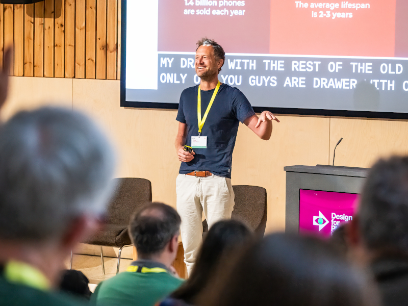
Simon Fisher, founder, F Mark
Kramer added: 'In our field, we probably use less coloured lighting now. I guess it was a fashion thing when RGB lighting first came out and everyone felt it had to be applied everywhere, but now people have probably become a little desensitised to it. Because it was overused, it somehow lost impact. When it's use subtly and simply, it can be effective.'
But is lighting such a specialist skill that it calls for outside expertise? Kramer said he wouldn't personally use a lighting designer: 'I think lighting is an integral part of having a vision. There is a technical element of course, but in terms of the mood or overall palette you're trying to create, I think it's a core part of the design.
'We've gone through an era of saturated colour and have used lighting to help achieve that. I wonder if now it is more about contextualising it and using it in more constrained and interesting ways. A lot of interiors you see in the commercial sector are saturated with colour on the walls and furniture, the whole lot. It can look a bit Toytown. The contract interiors sector has been at that end for a long time and I'm wondering if less is more.'

Jenny Weiss, director, Hill House Interiors
So when it comes to colour trends, are there any discernible patterns out there right now? Jenny Weiss, also a director at Hill House Interiors, said: 'It's hard to really get to the bottom of. You could ask 20 designers what they felt were the hot colour trends and they would all come up with something different.'
She added: 'It's interesting looking around the table at what we're wearing. Some of us are in bright and bold colours, others are a little more muted, but no-one has gone 'noncolour'," to which Littlefair responded: "But what is 'non-colour'? I see colour in lots of neutrals, in terms of shades and texture.'


