Coloured light in offices
Coloured lighting can be controversial and there are few more sensitive situations for its use than the workplace. Hoare Lea partner Dominic Meyrick considers chromaticity in the office environment

Since the introduction of LEDs, coloured light has become easier to facilitate because of the relative simplicity with which it can be introduced. Gone are the days when a complicated array of fluorescent battens and filters were required. With LEDs, colour was available before white light. And it came with a bonus – because it had previously been used in the theatre, it had DMX control.
However, with this came challenges – designers got carried away and problems arose when saturated colour was imposed on neutral finishes. Colour-changing LEDs used on a restaurant ceiling, for example, led to one food critic feeling more than a little disconcerted as she watched her mash morphing from pink, to green to blue.
Some 15 years ago, I remember going to an office where Xbox was being developed. Fluorescents and filters had been used to create a dark green colour and it was a bit like walking into a mosh pit – smelly and dark. Green was used to bring the colour associated with the brand logo into the room. Indeed, colour in the workplace is invariably about branding and it often forms part of a branding strategy for a building or for a company that occupies an office.

At the London offices of M7G Real Estate, a colour wall sits behind reception, while a thin blue line of light leads into the working environment, acting as both a branding tool and to aid wayfinding
However, it is not so great for skin tone – and in an office, indeed anywhere, people want to look good. A person’s skin tone is a critical measure of their wellbeing. With saturated light, surfaces, including skin tone, suffer. So, while coloured light can be used in any environment, white light must ‘cage’ the colour.
So beyond branding, does coloured light in the actual working environment serve a purpose? In a workspace the lighting level needs to enable you to work and to collaborate. Colour doesn’t help with reading a text or interacting with colleagues – especially if they are going pink and blue.
Colours, especially saturated colours, can also signal emotions. In Western culture, for example, red can signify danger. There is, however, a place for chromatic light within the office, although it needs to be done judiciously in terms of its location, its control and the choice of colours. A constant view of a bright wall of coloured light briskly rotating through a rainbow of colours would be a distinct distraction and not in the interest of most workers.
 Sky blue is the choice for this part of the office
In Hoare Lea’s London office in King’s Cross coloured lighting is used, with careful consideration and placement, in working areas. First it is installed under the mezzanine, where lines of white light, suspended between acoustic rafts, provide ambient task light. On the back of each raft, uplighting the ceiling, linear RGB luminaires create a feature-colour backdrop. At the far end of the office there is a stimulating piece of light art, with a video-feed generating ambient, slow-moving colours. This Pixel Cloud is backlit by an RGB pixel board array.
Each meeting room features a diffuse colour-changing panel, edged by a performance downlight aluminiumextrusion luminaire. The panel provides up to 72 DMX channels, offering extensive scene-setting options. Behind the stretch ceiling panel, eight extrusions in combinations of two types of RGB frequencies, and dynamic white, enable the creation of an extensive range of colours. There is also a sunset/sunrise setting. This shows a gradual change in light over time, with the pinks and purples associated with the beginning and end of the day, and aqua and sky blue with the middle.
I often show people the office and they usually ask questions about the coloured lighting: does it change in response to the outside environment? Does it enhance people’s wellbeing? Does it increase productivity? To which I usually answer: ‘No… it just looks good.’
 The sunset/sunrise setting option in a meeting room panel
Of course, it’s not really that simple, but for me, these questions hint at a battery-hen approach to designing for the workspace. What do we want – to increase productivity by adjusting colour temperature, so that workers might lay more eggs? This seems the wrong way round to this chicken/egg dilemma. If lighting is good, people will be happier in the workplace, and we don’t need science to tell us that productivity might improve if workers are reasonably happy to walk through the door on a Monday morning. Lighting has a value to the viewer and we want to design lighting that is admired and creates a good feeling. This is hard to quantify and to explain because it is an emotional rather than rational response.
Colour is subtle. It creates a feeling, which might be calming and may assist health and wellbeing, but if the environment is good then other things will follow. As my colleague at Hoare Lea, Jonathan Rush, says: ‘All light we design is human-centric. Although the colour temperature of white light is not usually divisive, coloured light can generate strong opinions.’
The response to the coloured light used in our London office has been positive and people like the colour-change. At first the colours under the mezzanine were primary and these were not popular, but when secondaries were set, people liked it. This also had the benefit of employees feeling their views were acted on. The subtlety of the colours used, as well as the control applied to these elements, makes them an addition to the interior palette as opposed to an overbearing feature.
Currently colour is not specified in the working environment as a general rule. Architects and interior designers may want colour, but it remains in the ‘nice to have’ category and offices are under financial pressure. Of course, if you could prove a positive link between productivity and colour then coloured light would be everywhere.
 In the atrium of Microsoft Building 5, its pod meeting rooms have colour-changing LEDs that indicate if rooms are free
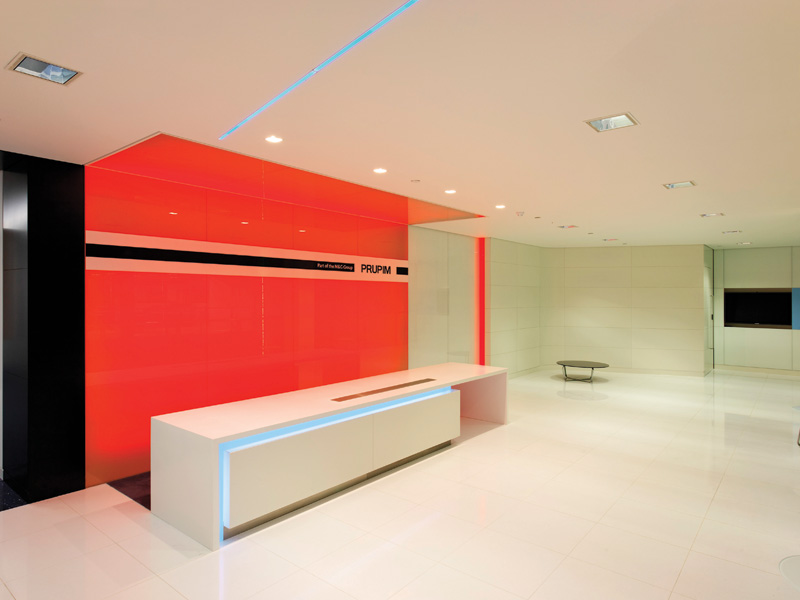
While colour is generally not specified in the task area, it can be useful for delineating the workspace. At the London offices of PruPim, now M&G Real Estate, we introduced a ‘blue’ wall behind the reception desk. As visitors walk towards reception the blue light merges with white – the white light cages the blue and holds it in place. A thin blue line of light leads from the reception into the corridor and then into the working environment. This was introduced as part of the branding strategy with the aim of bringing colour further into the office and also of course to aid navigation.
Colour can also be used as an indicator. In a scheme for Microsoft Building 5, the atrium has ‘pod’ meeting rooms with colour-changing LEDs. These were colour coded to show if the rooms were free or in use, and to indicate how long they would be available for.
Coloured light has been used inappropriately in many applications and this has put some people off, but this is not about being purist about white light – with the importance of task and skin tone, using white light simply makes sense in working environments.
White light is associated with lux levels and visual acuity in the mindset of office owners and developers. Put simply, you need light for people to do tasks. We also have to bear in mind the mix-age workforce – a person aged 60 may need three times the light needed by a 20-something. So, firms with a young workforce, with good eyes and without the eyestrain from pen and paper work may be able to get away with less white light.
A related issue in any discussion about the use of coloured lighting in offices is the use of different colour temperatures of white light. A warm colour temperature will have more red light and less blue, while a cool white will have more blue and less red. If we introduce more blue light to a 4000K space, then the overall colour temperature would be cooler and if you add red the space would be warmer. (It is the same principle as used in photography with filters.) If colour is introduced subtly, you can achieve a subtle change in white colour temperature, using saturated coloured light.
While research into humancentric or biodynamic lighting and circadian stimulation may suggest coloured lighting has a role, I feel this fades in significance when we consider the importance of access to natural light. So, bring some colour to the workspace – but first and foremost do so because it looks good.
Looking to the future there is no doubt that the dominance of lighting level is waning, and lighting is becoming more about experience design and experience providers. The future might be the creation of the sky colour above your head to order – perhaps the inside/ outside sky described by JK Rowling in Harry Potter and the Philosopher’s Stone: ‘Harry looked upwards and saw a velvety black ceiling dotted with stars. He heard Hermione whisper, “It’s bewitched to look like the sky outside, I read about it in Hogwarts: A History”. It was hard to believe there was a ceiling there at all, and that the Great Hall didn’t simply open on to the heavens.’ Blue sky thinking?
Do’s and Don’ts of using Colour
- Don’t think of people as battery hens and expect colour to increase productivity
- Don’t use as a direct lighting element within task areas
- Do keep use to a minimum – don’t make half the lighting coloured light
- Do stay clear of strong primary colours, use pastels and softer colours
- Do use static colour or ensure any dynamic colour change is slow enough to be almost unperceivable
- Do consider the material to be lit and how this will be affected