Bay Area Behemoth: SFMOMA by Snøhetta
Architecture practice Snøhetta’s largest American building to date has just opened, seeing some of Mario Botta’s features from the 1995 original San Francisco Museum of Modern Art removed and receiving mixed reviews for its design. But with several of the new SFMOMA’s featured artists congratulating Snøhetta, it’s happy

Words John King
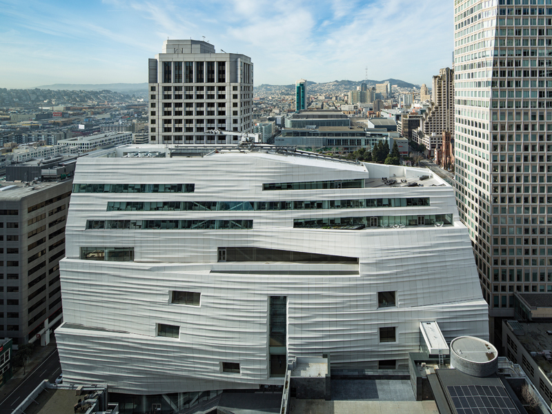
If there’s such a thing as a diffident 22,000 sq m, 62m-tall urban building, then it’s the new wing of the San Francisco Museum of Modern Art designed by the New York office of the Norwegian architecture practice Snøhetta.
The long slab rises in the middle of a congested block behind the 1995 museum designed by Switzerland’s Mario Botta, and the upper three floors of this 10-storey addition are notched back to leave ample breathing room for the wilfully iconic granite oculus that Botta placed atop his red-brick citadel. The newcomer is a discreet offwhite and is tapered on the other side of the slab as well, as if ceding ground to such neighbours as the 26-storey Pacific Telephone Building, a terracotta-cloaked gem from 1925 (by Miller and Pfflueger).
 The night view of SFMOMA’s 61m addition by Snøhetta — Richard Serra’s sculpture Sequence is visible in the gallery at the base. Image: Henrik Kam, courtesy SFMOMA
But diffident does not mean shy - and with its largest American building to date, Snøhetta has embraced the challenge of meeting Botta’s monumental postmodernism with an equally large structure, while also removing several of Botta’s most distinctive architectural flourishes. The firm founded in Oslo also reorientated the 21-year-old structure to celebrate the alleyways and activities around it, rather than standing aloof from the scene.

When the initial concept was released in 2011, Snøhetta’s architects spoke as if they were bringing a slice of nature into the heart of the city, using analogies such as a glacier and an eroded cliff.
 The facade’s 700-plus fibreglass reinforced polymer panels were made 50 miles from San Francisco, and are the most extensive use of this material to date in the US. Photo: Jon Mcneal, © Snøhetta
As for one of the most unusual aspects of the design - creases that ripple across the curved side of the addition that faces the bay, like corduroy slacks laid on their side - Snøhetta co-founder Craig Dykers suggests that an inspiration was the city’s fabled fog, which rolls in from the ocean on most summer days. Turning concept into reality though took some doing.
 The museum sits amid towers built in this former working-class district since the 1980s, including a hotel-residential highrise by SOM to its north (at the back of this image). Photo: Iwan Baan, Courtesy SFMOMA
Yes, in 2011 Snøhetta’s Simon Ewings spoke evocatively of how ‘We’re aiming for the sense of natural surfaces… worked by a craftsman’s hand.’ But the structural issues of weight and cost pushed in technical directions that for a large American building - especially one with architectural ambitions - were uncharted ground. ‘We always knew we wanted something that was masonry, and I use that term broadly,’ said Dykers, one of the more affable architects you’ll meet, on the eve of the remade SFMOMA’s debut. ‘But we soon realised that if we didn’t find a way to build more economically the staff would have to leave.’

As the design evolved one floor was shaved off and the side facing the bay grew thicker, developing a sort of midriff bulge (the third through seventh floors are devoted to galleries, with the three levels above reserved for staff, complete with outdoor terraces behind the oculus). Instead of granite or marble or precast concrete, Snøhetta worked with manufacturer Kreysler and Associates to devise a lightweight panel system of fibre glass reinforced polymer; an individual mould was cut by computer for each of the 700-plus panels, then filled with the fibre glass mix - an approach at a scale never before done in the USA, and the first time that the panels were allowed by fire inspectors to be installed above a building’s fourth floor.
 The view from Yerba Buena Gardens shows the contrast between Mario Botta’s pomo building for SFMOMA that opened in 1995, and the Snøhetta Addition. Photo: Jon Mcneal, © Snøhetta
Though technically ingenious, the unusual facade has a problem: it doesn’t look real. The rippled side with its matte finish is fascinating up-close (knock on a panel and hear the ping - it’s hollow), and it indeed amplifies the play of shadows and light as Dykers had hoped. But the flat, glossy north and south walls of the addition have a plastic sheen, with open seams between each panel; though it’s true that building skins today often are acts of architectural deception (Botta’s thick masonry consists of bricks glued to panels off-site), these look as though you could pry one off with a crowbar as a souvenir.
 The rippled, tapered eastern facade is intended in part to amplify the visual shift of sunlight and shadows throughout the day. Photo: Henrik Kam, Courtesy SFMOMA
Another thing that makes the panel-clad shaft look weightless in comparison to its imposing partner is that on Howard Street, where the entrance to the new wing is located, the bottom level consists of a 7.5m-high gallery with glass walls along the sidewalk and the alley-like path leading up to the entrance beneath the oculus. It’s one of many civic gestures in the building - until at least 2018 the gallery will hold exactly one work: Richard Serra’s immense coiled steel sculpture Sequence.
 The third-floor sculpture includes an extensive living wall and includes spillover from a gallery inside devoted to works by Alexander Calder. Photo: Henrik Kam, Courtesy SFMOMA
And there’s no admission charge to walk through it, or relax on the tiered seating that leads up to the new main entry hall. This is a profoundly different point of entry from the cave-like portal that Botta framed snugly with dark brick on three sides, and it speaks to the stylistic and cultural differences between the old wing and the new.
 A broad open staircase leading from Botta’s atrium up to the addition’s entry hall links the old and new wings. Photo: Iwan Baan, Courtesy SFMOMA
The original museum structure was conceived when this part of town was viewed by many prosperous San Franciscans as the wrong side of the tracks. Botta’s response was a self-contained destination flanked by parking lots, across from a park that had only opened the year before the museum arrived. The sense of ceremonial self-importance continued inside: the portal leads into a sky-lit atrium beneath the oculus, designed more for events than the display of art.
 Richard Serra’s coiled Corten Sequence on the ground floor of the new wing fills a tall gallery that faces the street and is open to the public free of charge. Photo: Henrik Kam, Courtesy SFMOMA
That 1995 building included a stacked staircase encased in bands of smooth and polished granite at the back of the atrium, the most architecturally potent space inside the structure. Now it’s gone, replaced by a wide staircase that angles up to the new entry hall, the same one reached by the pathway and outdoor staircase from Howard Street. It’s an odd location, made more odd by the presence of alleyway loading docks below.
 A typical gallery in the Snøhetta addition, this one filled during the opening exhibition with Ellsworth Kelly paintings. Photo: Iwan Baan, Courtesy SFMOMA
Dykers has taken heat about this but explains it as the logical outcome of the need to fuse the two halves of the museum - the 1995 staircase essentially would have filled the hinge between the two buildings, blocking any visual connection as well as an easy back-and-forth between the two entrances into the building. ‘From a practical perspective, it would have been impossible’ to make the rigid verticality of Botta’s staircase work with today’s more sprawling floorplate, Dykers argues, adding ‘It would have become a relic’.
For his part, Botta declined to comment this spring - but responded to my inquiry after the planned switch was revealed in 2011 with a politely non commital email: ‘The recent addition has been assigned to another architect. I was not invited to submit my proposal and now I don’t feel up to expressing any easy judgements on the choices made by a competent designer like Snøhetta.’
Left to itself, free of the logistics involved with linking old and new inside and out, Snøhetta shows the confident blend of function and flair that has made such works as the Oslo Opera House so compelling. Dykers takes great pride in pointing out how the needs of contemporary galleries are satisfied as discreetly as possible, whether it’s the lack of visible ventilation grates in the maple flooring (ducts are incorporated into the ceiling’s lighting system) or the use of concealed LEDs to bathe the galleries in adjustable ambient light. At a larger scale, the five floors dedicated to art are arranged so that the circulation is pulled out to the bay-facing bulge, what Dykers calls the ‘city galleries’. In terms of exhibition planning, this allows for flexibility in the layout of the near column-free space in the slabs; it also means that windows could be punched into the walls to offer a visual break from the ticketed show, complete with deep window sills that double as seating nooks.
 Steep enclosed staircases between the gallery levels are intended in part as homage to a distinctive Mario Botta staircase removed during the expansion. Photo: Iwan Baan, Courtesy SFMOMA
Inevitably, the success of the galleries will be in the eye of the beholder - the amount of gallery space within the museum walls totals 14,000 sq m, making it the largest contemporary art museum in North America. It’s a daunting scale, especially when you find yourself in yet another grid of art-filled rectangles that seem to unfold toward the horizon. But give Snøhetta credit: even with the abundance of maple floors and white walls, the stacked galleries never have the corporate anonymity of New York’s MOMA. A particularly inventive touch is how the staircases between the floors are pulled apart and slid into the city galleries seemingly at random, one entry per floor. They’re steep and enclosed, bending with the arc of the exterior walls, so that you feel you’re ascending toward an attic. The idea in part is to offer homage to the lost Botta staircase - the sensory experience is utterly different but, in its own way, equally satisfying.
 The “city gallery” on each upper floor runs the length of the cliff-like façade and offers seating-friendly window nooks with views of the blocks to the east. Photo: Iwan Baan, Courtesy SFMOMA
Initial critical response is mixed, with some out-of-town reviewers going so far as to say that the Botta frontispiece should have been done away with entirely (as though the built terrain of a dense city is a sculpture garden, the pieces to be rearranged or removed whenever styles shift). But in the aftermath of the invitation-only gala before member previews began, Dykers was savouring a much different form of feedback.
 A view down toward the main entry hall, with the walls serving as a canvas for Sol LeWitt’s Wall Drawing 895: Loopy Doopy. Photo: Henrik Kam, Courtesy SFMOMA
Such prominent artists as Anselm Kiefer, Ed Ruscha and Wayne Thiebaud were not only on the walls, but at the bash - and made it a point to seek out Dykers and convey their approval. ‘I met so many of my heroes that night, so it was exceptional to hear their reactions,’ he said afterwards. Any other good signs? ‘I did spot some people kissing in the corners. So our return on investment looks positive.’